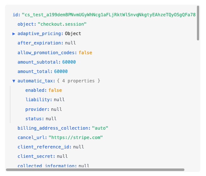
A Vue 3 component to interactively visualize JavaScript objects, similar to browser developer tools.

- 🔍 Interactive visualization of JavaScript objects and arrays
- 🌳 Support for nested data structures
- 🎨 Syntax highlighting for different data types
- 🎭 Multiple themes: light, dark, and monokai
- 🖌️ Fully customizable colors
- 📦 No external dependencies
- 🔄 Expand/collapse nodes for better navigation
- 💻 Style similar to browser developer tools
- 🌐 Compatible with Vue 3
npm install vue-js-object-vieweryarn add vue-js-object-viewer// main.js
import { createApp } from 'vue'
import App from './App.vue'
import VueJsObjectViewer from 'vue-js-object-viewer'
const app = createApp(App)
app.component('VueJsObjectViewer', VueJsObjectViewer)
app.mount('#app')<template>
<div>
<h2>My Object:</h2>
<VueJsObjectViewer :data="myObject" />
</div>
</template>
<script setup>
import { ref } from 'vue'
import VueJsObjectViewer from 'vue-js-object-viewer'
const myObject = ref({
name: 'John',
age: 30,
active: true,
skills: ['JavaScript', 'Vue', 'CSS'],
address: {
street: 'Main Street',
city: 'Example City',
zipCode: '12345'
}
})
</script>| Prop | Type | Required | Description |
|---|---|---|---|
| data | Any | Yes | The data to visualize. Can be any JavaScript data type (object, array, string, number, etc.) |
| theme | String | No | The color theme to use. Options: 'light' (default), 'dark', or 'monokai' |
| colors | Object | No | Custom colors object to override the default theme colors. See Color Customization section below |
<VueJsObjectViewer :data="{ name: 'John', age: 30 }" /><VueJsObjectViewer :data="[1, 2, 3, 'four', { five: 5 }]" /><VueJsObjectViewer :data="{
user: {
profile: {
name: 'Anna',
contact: {
email: 'anna@example.com',
phone: '555-1234'
}
},
settings: {
theme: 'dark',
notifications: true
}
}
}" /><VueJsObjectViewer :data="{
text: 'Hello World',
number: 42,
boolean: true,
null: null,
undefined: undefined,
function: function() { return 'test'; },
date: new Date(),
regularExpression: /test/g
}" />The component supports three built-in themes:
light(default): Light theme with blue keys and colored valuesdark: Dark theme optimized for dark backgroundsmonokai: Monokai-inspired theme with vibrant colors
<!-- Using the dark theme -->
<VueJsObjectViewer :data="myObject" theme="dark" />

<!-- Using the monokai theme -->
<VueJsObjectViewer :data="myObject" theme="monokai" />You can completely customize the colors by providing a colors object with the following properties:
<template>
  <VueJsObjectViewer :data="myObject" :colors="customColors" />
</template>

<script setup>
import { ref } from 'vue'
import VueJsObjectViewer from 'vue-js-object-viewer'

const myObject = ref({ /* ... */ })

const customColors = {
  undefined: '#6b7280',  // Color for undefined values
  null: '#6b7280',       // Color for null values
  string: '#10b981',     // Color for string values
  number: '#0ea5e9',     // Color for number values
  boolean: '#f59e0b',    // Color for boolean values
  function: '#a855f7',   // Color for function values
  key: '#3b82f6',        // Color for property keys
  expandIcon: '#3b82f6', // Color for expand/collapse icons
  background: 'transparent', // Background color
  hover: '#0000001a',    // Background color on hover
  border: '#5b5b5b36',   // Border color
  summary: '#666',       // Color for object summary text
  default: '#333'        // Default text color
}
</script>
The colors prop takes precedence over the theme prop if both are provided.
Contributions are welcome. Please feel free to open an issue or submit a pull request.
Created by Enrique Marín Hirales