-
Notifications
You must be signed in to change notification settings - Fork 50
Feature Showcase App Guide
Tips on how to use this Guide:
When you see a feature that you would like to implement, copy or take note of the search term (e.g., #SearchTermExample) and perform a search here. You will be presented with
- a short description of the feature,
- code snippets and where to find them in the source code,
- and in some cases, a link to the official RAP documentation for more information.
💡 Take note that the links will always lead you to the RAP documentation for the latest release! You have to take into account the version of the system you have.
Alternatively, you can search for an annotation here, get the search term, and use it to locate the UI feature in the app. If the annotation cannot be found, it could simply mean that it is not showcased in the current release.
- General Features
-
List Report
- List Report - Header Area
-
List Report - Content Area
-
Configuring Tables
- Actions - List
- Presentation Variant - List Report
- Selection Variant - List Report
- Selection Presentation Variant - List Report
- Defining the Default Sort Order
- Highlighting Line Items Based on Criticality
- Adding a Rating Indicator to a Table
- Adding a Progress Indicator to a Table
- Adding a Smart Micro Chart to a Table
- Adding a Contact Quick View to a Table
- Adding a Quick View to a Table
- Adding Multiple Fields to one Column in a Table
- Adding Images to a Table
- Adding Currency or UoM Fields to a Table
- Adding Large Object/Stream Property to a Table
- Adding Navigation with URL to a Table
-
Configuring Tables
-
Object Page
- Object Page - General Features
- Object Page - Header Area
- Object Page - Content Area
Search term: #IANATimezone
💡 Only available with the latest SAP BTP or SAP S/4HANA Cloud, public edition release and for SAP S/4HANA, on-premise edition or SAP S/4HANA Cloud, private edition, from release 2023 onwards.

With the annotation @Semantics.timeZone you can convert a timezone to one specified according to the IANA standard. You are also able to assign this converted timezone to a timestamp (which has to be in the UTC format) so that the time will be interpreted in this timezone. The annotation to use is @Semantics.timeZoneReference.
The conversion of the timezone is happening at the backend, while the timestamp conversion is done by the UI.
This feature is also available for use with action/function parameters.
In the following example, changing the SAPTimezone field will also change IANATimezone and IANATimestamp, which are both shown in IANA standard and changing Timestamp will change IANATimestamp automatically. This is achieved via side effect.
ℹ️ Source: CDS View /DMO/FSA_R_RootTP
// Search Term #IANATimezone
@Consumption.valueHelpDefinition: [{ entity: { name: 'I_TimeZone', element: 'TimeZoneID' } }]
SAPTimezone,

@Semantics.timeZone: true
SAPTimezone as IANATimezone,

Timestamp,

@Semantics.timeZoneReference: 'IANATimezone'
Timestamp as IANATimestamp,
// End Search Term #IANATimezone
ℹ️ Source: Metadata Extension /DMO/FSA_C_RootTP
// Search Term #IANATimezone
@UI.facet: [
  {
    parentId   : 'Nested',
    id         : 'TimeAndDate',
    label      : 'Time and Date (#TimeAndDate)',
    type       : #COLLECTION
  },
  // Search Term #IANATimezone
  {
    parentId   : 'TimeAndDate',
    type       : #FIELDGROUP_REFERENCE,
    targetQualifier: 'TimezoneInput',
    label      : 'SAP Timezone'
  },
  {
    parentId   : 'TimeAndDate',
    type       : #FIELDGROUP_REFERENCE,
    targetQualifier: 'TimezoneOutput',
    label      : 'IANA Timezone'
  }
]

@UI.fieldGroup: [
  {
    qualifier: 'TimezoneInput',
    position: 10,
    label: 'SAP Timezone'
  },
  {
    qualifier: 'TimezoneInput',
    dataAction: 'overwriteTimezone',
    type: #FOR_ACTION,
    emphasized: true,
    label: 'Overwrite Timezone (#IANATimezoneAParameter)'
  }
]
SAPTimezone;

@UI.fieldGroup: [{
  qualifier: 'TimezoneOutput',
  position: 10,
  label: 'IANA Timezone (#IANATimezone)'
}]
IANATimezone;

@UI.fieldGroup: [{
  qualifier: 'TimezoneInput',
  position: 20
}]
Timestamp;

@UI.fieldGroup: [{
  qualifier: 'TimezoneOutput',
  position: 20,
  label: 'IANA Timestamp (#IANATimezone)'
}]
IANATimestamp;
// End Search Term #IANATimezone
Side effects for timezone
ℹ️ Source: Behaviour Definition /DMO/FSA_R_RootTP
define behavior for /DMO/FSA_R_RootTP alias Root
...
{
  side effects {
    field SAPTimezone affects field IANATimestamp, field IANATimezone;
    field Timestamp affects field IANATimestamp;
  }
}
Search term: #ValueHelps, #DependentFilter
The implementation of a value help in CDS enables the end user to choose values from a predefined list for input fields on a user interface.
The additional binding defines a second condition for the value help on the same target value help provider entity for filtering the value help result list and/or returning values from the selected value help record. The additional binding can be defined for an additional element or parameter. Depending on the value provided in usage, the additional binding works as a filter, result or filter and result condition
Usage: #Result: The referenced element or parameter in localElement or localParameter is filled with the value provided by the value help. When creating an instance, you can fill various fields with this option.
ℹ️ Source: CDS View /DMO/FSA_R_RootTP
// Search Term #ValueHelps
@Consumption.valueHelpDefinition: [
  {
    entity: { name: '/DMO/FSA_I_Criticality', element: 'Code' },
    additionalBinding: [{ element: 'Name',
                          localElement: 'FieldWithCriticality',
                          usage: #RESULT }]
  }
]
CriticalityCode,
Usage: #Filter : The value of the referenced element or parameter in localElement or localParameter is used as a filter for the value help. The value help only displays filtered results.
// Search Term #DependentFilter
@Consumption.valueHelpDefinition: [
  {
    entity: { name: '/DMO/FSA_I_Contact', element: 'ID' },
              label: 'Contacts',
              additionalBinding: [{ element: 'Country',
                                    localElement: 'Country',
                                    usage: #FILTER }]
  }
]
ContactID,
You can influence what is shown in the value help using @Consumption.valueHelpDefault.display. In the example below, everything except for ID (Name), phone, country, street, city and postcode would be hidden in the value help.
ℹ️ Source: CDS View /DMO/FSA_I_Contact
define view entity /DMO/FSA_I_Contact
...
{
      @ObjectModel.text.element: ['Name'] // Search Term #DisplayTextAndID
      @UI.textArrangement: #TEXT_ONLY
      @EndUserText.label: 'Contact'
  key id            as ID,

      @Consumption.valueHelpDefault.display:false
      name          as Name,

      @Consumption.valueHelpDefault.display:true
      phone         as Phone,

      @Consumption.valueHelpDefault.display:false
      building      as Building,

      @Consumption.valueHelpDefault.display:true
      country       as Country,

      @Consumption.valueHelpDefault.display:true
      street        as Street,

      @Consumption.valueHelpDefault.display:true
      city          as City,

      @Consumption.valueHelpDefault.display:true
      postcode      as Postcode,

      @Consumption.valueHelpDefault.display:false
      address_label as AddressLabel,

      @Consumption.valueHelpDefault.display:false
      photo_url     as PhotoUrl,
      ...
}
For smaller collections of possible values in the value help, it might be a good idea to have a dropdown instead of a dialog to choose the value. This can be achieved with the @ObjectModel : { resultSet.sizeCategory: #XS }
ℹ️ Source: CDS View /DMO/FSA_I_Criticality
@ObjectModel : { resultSet.sizeCategory: #XS }

define view entity /DMO/FSA_I_Criticality
...
More Information: ABAP RESTful Application Programming Model - Providing Value Help
Search term: #useForValidationVH
💡 Only shown in the latest SAP BTP or SAP S/4HANA Cloud, public edition release and for SAP S/4HANA, on-premise edition or SAP S/4HANA Cloud, private edition, from release 2023 onwards.
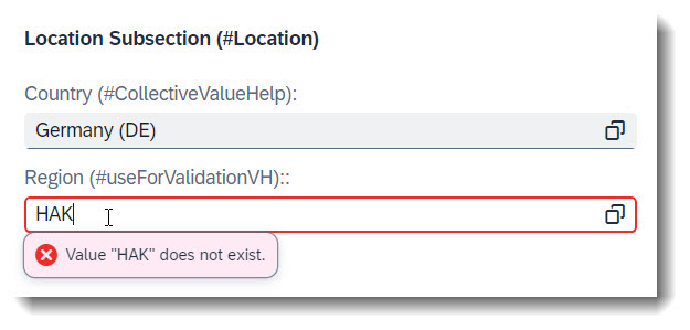
To mark a value help as an input validator, one can use the keyword useForValidation: true in the annotation @Consumption.valueHelpDefinition. It can be annotated at a field, a CDS parameter or an action parameter.
It is good practice to use the keyword qualifier for every value help, even if the field only has one. If you have defined more than one value help at a field, useForValidation might not work correctly if you have forgotten to use qualifiers, as UI would not be able to determine which value help is to be used for validation.
This keyword does not work for collective value helps.
💡 If you have a draft-enabled app, using this annotation prevents an invalid value from being saved to draft. A refresh of the page will clear the user input.
💡 Another alternative to this annotation would be to use a drop down list with @ObjectModel : { resultSet.sizeCategory: #XS }, if there are not too many available choices.
ℹ️ Source: CDS View /DMO/FSA_R_RootTP
// Search Term #useForValidationVH
@Consumption.valueHelpDefinition: [{  entity: { name: 'I_RegionVH', element: 'Region' },
                                      qualifier: 'RegionValueHelp',
                                      useForValidation: true,
                                      additionalBinding: [{ element: 'Country',
                                                            localElement: 'Country' }] }]
Region,
Search term: #StaticFeatureCtrl
Each field can have specific access restrictions, defined in the behaviour definition. If the access restriction is always the same for each instance, you can use static feature control. Some examples/possible combinations are described here:
ℹ️ Source: Behaviour Definition /DMO/FSA_R_RootTP
define behavior for /DMO/FSA_R_RootTP alias Root
...
{
  field ( readonly, numbering : managed ) ID;
  field ( mandatory ) Email;
  field ( mandatory : create, readonly : update ) StringProperty;
}
There are 2 different types of readonly:
field ( readonly, numbering : managed ) ID; means that the field ID is a key that will be assigned a value by the framework (numering:managed) and must not be created or updated by the user at all (readonly). The annotation in $metadata is <Annotation Term="SAP__core.Computed"/>.
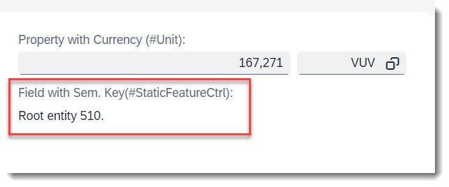
field ( mandatory : create, readonly : update ) StringProperty; means that the field StringProperty is only mandatory during create, but after that it will be read only. The annotation for the readonly in $metadata is <Annotation Term="SAP__core.Immutable"/>.
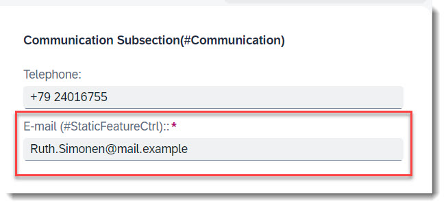
field ( mandatory ) Email; means that the user must provide a value for the field Email. The annotation in $metadata is <Annotation Term="SAP__common.FieldControl" EnumMember="SAP__common.FieldControlType/Mandatory"/>.
More Information: ABAP RESTful Application Programming Model - Static Feature Control
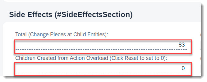
Each field can have specific access restrictions, defined in the behaviour definition and behaviour implementation. If the access restriction depends on a certain condition, you can implement the feature control dynamically.
ℹ️ Source: Behaviour Definition /DMO/FSA_R_RootTP
define behavior for /DMO/FSA_R_RootTP alias Root
...
{
  field ( features : instance ) TimesChildCreated;
}
ℹ️ Source: Behaviour Implementation /DMO/FSA_BP_R_ROOTTP
METHOD get_instance_features.
  result = VALUE #( FOR root IN roots
                      ( %tky = root-%tky
                        %field-TimesChildCreated        = if_abap_behv=>fc-f-read_only
                      ) ).
ENDMETHOD.
In this simple example, the field TimesChildCreated is dynamically assigned the restriction read-only.
The annotation in $metadata is <Annotation Term="SAP__common.FieldControl" Path="__FieldControl/TimesChildCreated"/>.

For dynamic control of operations and actions, the option (features: instance) must be added to the operation or action.
ℹ️ Source: Behaviour Definition /DMO/FSA_R_RootTP
define behavior for /DMO/FSA_R_RootTP alias Root
...
{
  delete (features : instance);
  action ( features : instance ) changeProgress parameter /DMO/FSA_D_ChangeProgressP result [1] $self;
}
ℹ️ Source: Behaviour Implementation /DMO/FSA_BP_R_ROOTTP
METHOD get_instance_features.
  READ ENTITIES OF /DMO/FSA_R_RootTP IN LOCAL MODE
    ENTITY Root
      FIELDS ( UpdateHidden DeleteHidden ) WITH CORRESPONDING #( keys )
    RESULT DATA(roots)
    FAILED failed.

  result = VALUE #( FOR root IN roots
                      ( %tky                    = root-%tky
                        %delete                 = COND #( WHEN root-DeleteHidden  = abap_true
                                                            THEN if_abap_behv=>fc-o-disabled
                                                            ELSE if_abap_behv=>fc-o-enabled  )
                        %action-changeProgress  = COND #( WHEN root-UpdateHidden  = abap_true
                                                            THEN if_abap_behv=>fc-o-disabled
                                                            ELSE if_abap_behv=>fc-o-enabled )
                        ) ).
ENDMETHOD.
The delete operation and action ChangeProgress will be disabled if the fields DeleteHidden or UpdateHidden has boolean value abap_true, and vice-versa.
More Information: ABAP RESTful Application Programming Model - Dynamic Feature Control
An action that is defined via Datafield ForAction is not tied to a specific data value. Therefore it is possible to assign the annotation to any arbitary element. Whether the action button is to be in the list report or object page, line item or section, this largely depends on the respective UI annotation you use. More examples are listed below in this guide, if you search for action.
The keyword to use for this is type: #FOR_ACTION in @UI.lineItem, @UI.fieldGroup, etc.
ℹ️ Source: Metadata Extension /DMO/FSA_C_RootTP
@UI.facet: [
  // Search Term #OPForm
  {
    purpose    : #HEADER, // or #STANDARD,
    label      : 'FieldGroup (#OPForm)',
    type       : #FIELDGROUP_REFERENCE,
    targetQualifier: 'OPForm',
    id: 'SubSectionID'
  }
]

@UI: {
  lineItem: [
    // Search Term #ActionInLineItem
    {
      type:#FOR_ACTION,
      label: 'Change Criticality (#ActionInLineItem)',
      dataAction: 'changeCriticality',
      position: 10
    }
  ],
  fieldGroup: [
    // Search Term #ActionInSection
    {
      qualifier: 'OPForm',
      dataAction: 'changeProgress',
      type: #FOR_ACTION,
      emphasized: true,
      label: 'Change Progress (#ActionInSection)'
    }
  ]
}
LastChangedAt;
ℹ️ Source: Behaviour Definition /DMO/FSA_R_RootTP
action changeCriticality parameter /DMO/FSA_D_ChangeCriticalityP result [1] $self;
action changeProgress parameter /DMO/FSA_D_ChangeProgressP result [1] $self;
More Information: ABAP RESTful Application Programming Model - Actions
💡 Only available with the latest SAP BTP or SAP S/4HANA Cloud, public edition release and for SAP S/4HANA, on-premise edition or SAP S/4HANA Cloud, private edition, from release 2023 onwards.
An action that is tied to a data value, which would be rendered as a hyperlink. Therefore it is crucial to specify the annotation at the desired element which has the data value. Whether the action button is to be in the list report or object page, line item or section, this largely depends on the respective UI annotation you use.
The keyword to use for this is type: #WITH_ACTION in @UI.lineItem, @UI.fieldGroup, @UI.identification.
More Information:
- List Report - Content Area - Datafield WithAction in Line Item
- Object Page - Header Area - Datafield WithAction in Object Page
Search term: #ValueHelpParameter
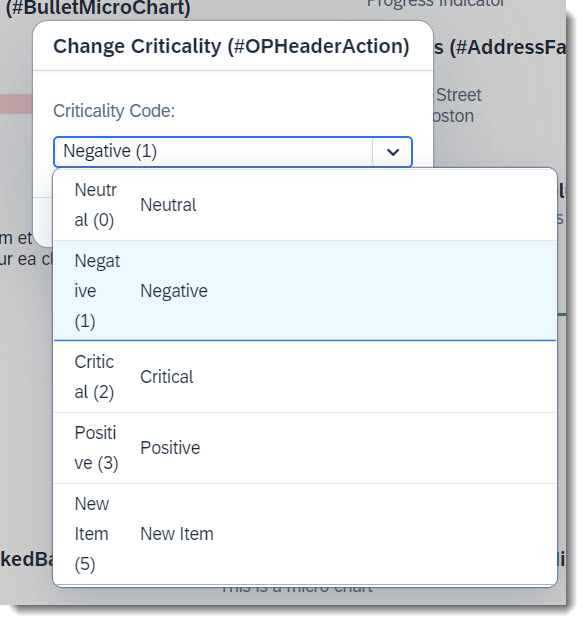
Often properties of an entity have value helps, so that creating a new entity is easier and wrong inputs are reduced. Value helps for action parameters are also possible.
ℹ️ Source: CDS Abstract Entity /DMO/FSA_D_ChangeCriticalityP
// Search Term #ValueHelpParameter
@Consumption.valueHelpDefinition: [{ entity: { name: '/DMO/FSA_I_Criticality',  element: 'Code' }}]
criticality_code : abap.int4;
This can be achieved, by just annotating the parameter with @Consumption.valueHelpDefinition.
Search term: #ParameterDefaultValue
With the annotation @UI.defaultValue a default value for the parameter is set. A fixed string value can be given or a property from the entity can be reference using syntax #( 'ELEMENT_OF_REFERENCED_ENTITY: <field_name>' ).
ℹ️ Source: CDS Abstract Entity /DMO/FSA_D_ChangeCriticalityP
// Search Term #ParameterDefaultValue
@UI.defaultValue : #( 'ELEMENT_OF_REFERENCED_ENTITY: CriticalityCode')
criticality_code : abap.int4;
💡 Only shown in the latest SAP BTP or SAP S/4HANA Cloud, public edition release and for SAP S/4HANA, on-premise edition or SAP S/4HANA Cloud, private edition, from release 2023 onwards.

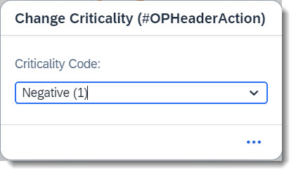
An action parameter now inherits the text label from the underlying data element. No additional effort is required other than maintaining the label (and localized text label) at the data element itself. For comparison, see the examples below.
Label from data element:
ℹ️ Source: Abstract Entity /DMO/FSA_D_ChangeCriticalityP
criticality_code : /dmo/fsa_criticality;
Label from annotation:
ℹ️ Source: Abstract Entity /DMO/FSA_D_ChangeProgressP
@EndUserText.label: 'Change Progress'
progress : abap.int4;
Search term: #IANATimezoneAParameter
💡 Only available with the latest SAP BTP or SAP S/4HANA Cloud, public edition release and for SAP S/4HANA, on-premise edition or SAP S/4HANA Cloud, private edition, from release 2023 onwards.
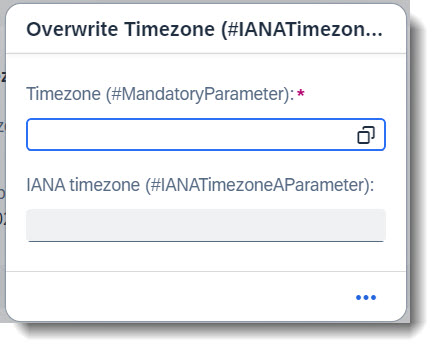
With the annotation @Semantics.timeZone you can convert a timezone to one specified according to the IANA standard. You are also able to assign this converted timezone to a timestamp (which has to be in the UTC format) so that the time will be interpreted in this timezone. The annotation to use is @Semantics.timeZoneReference.
The conversion of the timezone is happening at the backend, while the timestamp conversion is done by the UI.
This feature is also available for general use.
In the following example, the action overwriteTimezone expects a timezone input. Choosing a value using the value help will fill in the IANA Timezone as well.
ℹ️ Source: Abstract Entity /DMO/FSA_D_OverwriteTimezoneP
@EndUserText.label: 'Oerwrite Timezone parameter'
define root abstract entity /DMO/FSA_D_OverwriteTimezoneP
{
  // Search Term #MandatoryParameter
  @EndUserText.label: 'Timezone (#MandatoryParameter)'
  @Consumption.valueHelpDefinition: [{ entity: { name: 'I_TimeZoneIANACodeMap', element: 'TimeZoneID' },
                                       additionalBinding: [{ usage: #RESULT, localElement: 'iana_timezone', element: 'TimeZoneIANACode' }] }]
  sap_timezone : tznzone;

  // Search Term #IANATimezoneAParameter
  @Semantics.timeZone: true
  @EndUserText.label: 'IANA timezone (#IANATimezoneAParameter)'
  iana_timezone : tznzone;
}
ℹ️ Source: Behaviour Definition /DMO/FSA_R_RootTP
define behavior for /DMO/FSA_R_RootTP alias Root
...
{
  ...
  action ( features : instance ) overwriteTimezone deep parameter /DMO/FSA_D_OverwriteTimezoneP;
  ...
}
ℹ️ Source: CDS View /DMO/FSA_R_RootTP
// Search Term #IANATimezone
@Consumption.valueHelpDefinition: [{ entity: { name: 'I_TimeZone', element: 'TimeZoneID' } }]
SAPTimezone,
ℹ️ Source: Metadata Extention /DMO/FSA_C_RootTP
// Search Term #IANATimezone
@UI.facet: [
  {
    parentId   : 'Nested',
    id         : 'TimeAndDate',
    label      : 'Time and Date (#TimeAndDate)',
    type       : #COLLECTION
  },
  // Search Term #IANATimezone
  {
    parentId   : 'TimeAndDate',
    type       : #FIELDGROUP_REFERENCE,
    targetQualifier: 'TimezoneInput',
    label      : 'SAP Timezone'
  }
]

@UI.fieldGroup: [
  {
    qualifier: 'TimezoneInput',
    dataAction: 'overwriteTimezone',
    type: #FOR_ACTION,
    emphasized: true,
    label: 'Overwrite Timezone (#IANATimezoneAParameter)'
  }
]
SAPTimezone;
Search term: #MandatoryParameter
💡 Only available with the latest SAP BTP or SAP S/4HANA Cloud, public edition release and for SAP S/4HANA, on-premise edition or SAP S/4HANA Cloud, private edition, from release 2023 onwards.
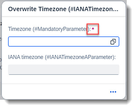
It is possible to define mandatory parameters for action/functions but to do this, you would need a behaviour definition for the abstract entity. This is typically a deep parameter with a hierarchy structure but instead of a true hierarchy with associations, we define the abstract entity as a flat structure.
In this example, the field sap_timezone should be a mandatory parameter and will be marked with a red asterisk (*) . The keyword to use is mandatory:execute, to be marked at the field in the behaviour definition.
ℹ️ Source: Abstract Entity /DMO/FSA_D_OverwriteTimezoneP
@EndUserText.label: 'Oerwrite Timezone parameter'
define root abstract entity /DMO/FSA_D_OverwriteTimezoneP
{
  // Search Term #MandatoryParameter
  @EndUserText.label: 'Timezone (#MandatoryParameter)'
  @Consumption.valueHelpDefinition: [{ entity: { name: 'I_TimeZoneIANACodeMap', element: 'TimeZoneID' },
                                        additionalBinding: [{ usage: #RESULT, localElement: 'iana_timezone', element: 'TimeZoneIANACode' }] }]
  sap_timezone : tznzone;

  // Search Term #IANATimezoneAParameter
  @Semantics.timeZone: true
  @EndUserText.label: 'IANA timezone (#IANATimezoneAParameter)'
  iana_timezone : tznzone;
}
Important keywords for the behaviour definition are abstract, with hierarchy; and with control.
ℹ️ Source: Behaviour Definition /DMO/FSA_D_OverwriteTimezoneP
abstract;
strict ( 2 );
with hierarchy;

define behavior for /DMO/FSA_D_OverwriteTimezoneP with control
{
  field (mandatory:execute) sap_timezone;
}
ℹ️ Source: Behaviour Definition /DMO/FSA_R_RootTP
define behavior for /DMO/FSA_R_RootTP alias Root
...
{
  ...
  action ( features : instance ) overwriteTimezone deep parameter /DMO/FSA_D_OverwriteTimezoneP;
  ...
}
More information: ABAP RESTful Application Programming Model - Modeling Parameters for Non-Standard Operations
Search term: #RecommendedDataTypesSection
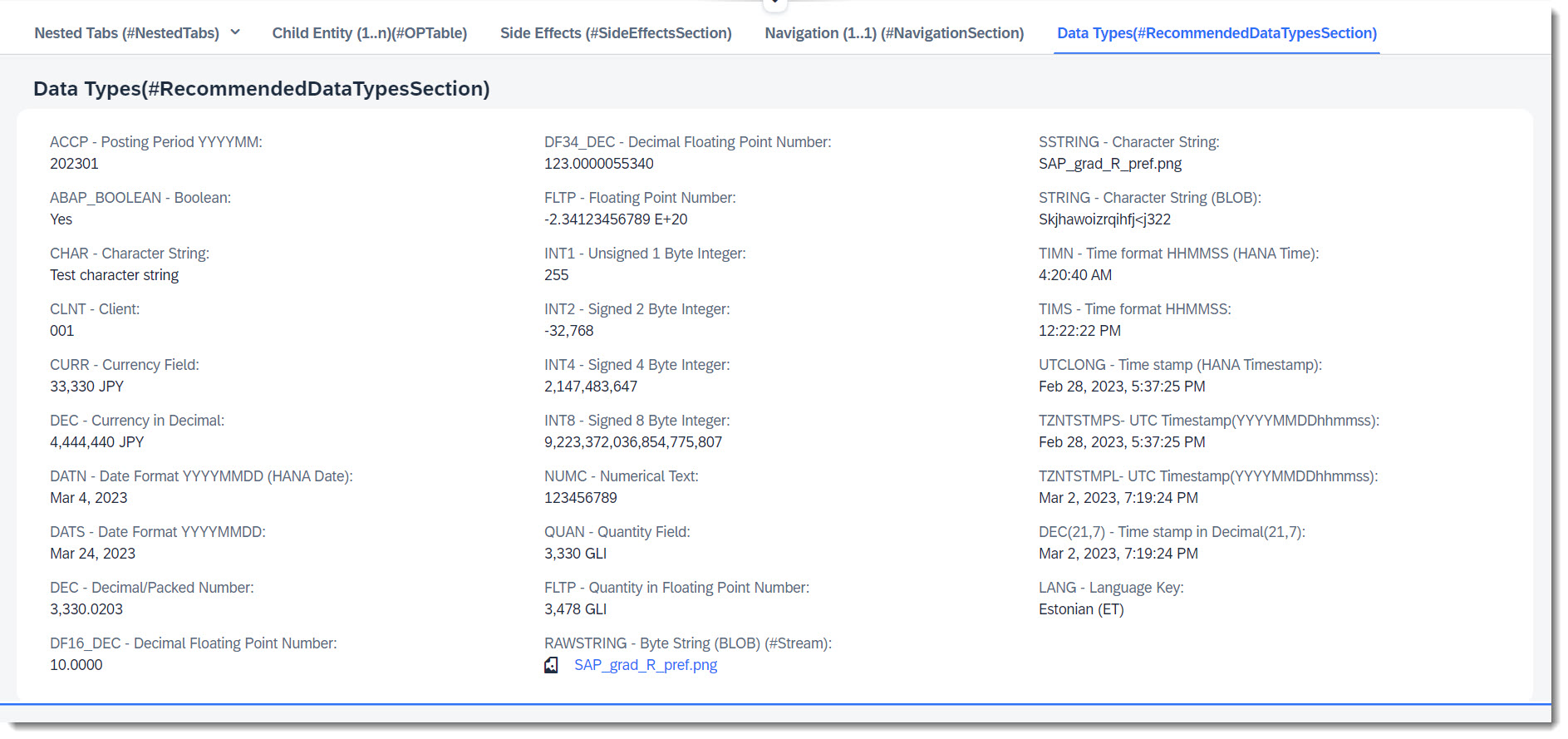
To define the data model of our business object, we have to create tables to store the data that the CDS view is built upon. For the backend to derive the correct data types for oData, there is a list of recommended, released built in ABAP types and data elements that you can use. There are used in the app and can be seen in the Object Page under Data Types(#RecommendedDataTypesSection).
ℹ️ Source: Database Table /DMO/FSA_Root_A
define table /dmo/fsa_root_a {
  key client                : abap.clnt not null;
  ...
  type_accp                 : abap.accp;
  type_bool                 : abap_boolean;
  type_char                 : abap.char(256);
  type_clnt                 : abap.clnt;
  type_cuky                 : abap.cuky;
  @Semantics.amount.currencyCode : '/dmo/fsa_root_a.type_cuky'
  type_curr                 : abap.curr(10,2);
  type_dec_amount           : abap.dec(10,2);
  type_datn                 : abap.datn;
  type_dats                 : abap.dats;
  type_dec                  : abap.dec(12,4);
  @AbapCatalog.decfloat.outputStyle : #NORMAL
  type_df16_dec             : abap.df16_dec(10,4);
  type_fltp                 : abap.fltp;
  type_int1                 : abap.int1;
  type_int2                 : abap.int2;
  type_int4                 : abap.int4;
  type_int8                 : abap.int8;
  type_lang                 : abap.lang;
  type_numc                 : abap.numc(128);
  @Semantics.quantity.unitOfMeasure : '/dmo/fsa_root_a.type_unit'
  type_quan                 : abap.quan(20,4);
  type_fltp_quan            : abap.fltp;
  type_rawstring            : abap.rawstring(0);
  type_sstring              : abap.sstring(256);
  type_string               : abap.string(0);
  type_timn                 : abap.timn;
  type_tims                 : abap.tims;
  type_unit                 : abap.unit(3);
  type_tzntstmps            : tzntstmps;
  type_tzntstmpl            : tzntstmpl;
  type_dec_time             : abap.dec(21,7);
  type_utclong              : abap.utclong;
  stream_mimetype           : abap.char(128);
  @AbapCatalog.decfloat.outputStyle : #NORMAL
  type_df34_dec             : abap.df34_dec(31,10);
}
ℹ️ Source: Metadata Extension /DMO/FSA_C_RootTP
annotate entity /DMO/FSA_C_RootTP with
{
  @UI.facet: [
    // Search Term #RecommendedDataTypesSection
    {
      purpose: #STANDARD,
      type: #FIELDGROUP_REFERENCE,
      targetQualifier: 'DataTypes',
      label: 'Data Types(#RecommendedDataTypesSection)'
    }
  ]
  @UI.fieldGroup: [{  position: 10, qualifier: 'DataTypes' }]
  TypeAccp;

  @UI.fieldGroup: [{  position: 20, qualifier: 'DataTypes' }]
  TypeBool;

  @UI.fieldGroup: [{  position: 30, qualifier: 'DataTypes' }]
  TypeChar;

  @UI.fieldGroup: [{  position: 40, qualifier: 'DataTypes' }]
  TypeClnt;

  @UI.fieldGroup: [{  position: 50, qualifier: 'DataTypes' }]
  TypeCurr;

  @UI.fieldGroup: [{  position: 60, qualifier: 'DataTypes' }]
  TypeDecAmount;

  @UI.fieldGroup: [{  position: 70, qualifier: 'DataTypes' }]
  TypeDatn;

  @UI.fieldGroup: [{  position: 80, qualifier: 'DataTypes' }]
  TypeDats;

  @UI.fieldGroup: [{  position: 90, qualifier: 'DataTypes' }]
  TypeDec;

  @UI.fieldGroup: [{  position: 100, qualifier: 'DataTypes' }]
  TypeDf16Dec;

  @UI.fieldGroup: [{  position: 110, qualifier: 'DataTypes' }]
  TypeDf34Dec;

  @UI.fieldGroup: [{  position: 120, qualifier: 'DataTypes' }]
  TypeFltp;

  @UI.fieldGroup: [{  position: 130, qualifier: 'DataTypes' }]
  TypeInt1;

  @UI.fieldGroup: [{  position: 140, qualifier: 'DataTypes' }]
  TypeInt2;

  @UI.fieldGroup: [{  position: 150, qualifier: 'DataTypes' }]
  TypeInt4;

  @UI.fieldGroup: [{  position: 160, qualifier: 'DataTypes' }]
  TypeInt8;

  @UI.fieldGroup: [{  position: 170, qualifier: 'DataTypes' }]
  TypeNumc;

  @UI.fieldGroup: [{  position: 180, qualifier: 'DataTypes' }]
  TypeQuan;

  @UI.fieldGroup: [{  position: 190, qualifier: 'DataTypes' }]
  TypeFltpQuan;

  @UI.fieldGroup: [{  position: 200, qualifier: 'DataTypes' }]
  TypeRawstring;

  @UI.fieldGroup: [{  position: 210, qualifier: 'DataTypes' }]
  TypeSstring;

  @UI.fieldGroup: [{  position: 220, qualifier: 'DataTypes' }]
  TypeString;

  @UI.fieldGroup: [{  position: 230, qualifier: 'DataTypes' }]
  TypeTimn;

  @UI.fieldGroup: [{  position: 240, qualifier: 'DataTypes' }]
  TypeTims;

  @UI.fieldGroup: [{  position: 250, qualifier: 'DataTypes' }]
  TypeUtclong;

  @UI.fieldGroup: [{  position: 260, qualifier: 'DataTypes' }]
  TypeTzntstmps;

  @UI.fieldGroup: [{  position: 270, qualifier: 'DataTypes' }]
  TypeTzntstmpl;

  @UI.fieldGroup: [{  position: 280, qualifier: 'DataTypes' }]
  TypeDecTime;

  @UI.fieldGroup: [{  position: 290, qualifier: 'DataTypes' }]
  TypeLang;
}
Search term: #QuickView
💡 Only available with the latest SAP BTP or SAP S/4HANA Cloud, public edition release and for SAP S/4HANA, on-premise edition or SAP S/4HANA Cloud, private edition, from release 2023 onwards.
A quick view is a pop up that shows more information, when you click on an entry in a column or an object page. Typically, it is used in combination with one-to-one or zero-to-one associations. By clicking on the link, more information about the associated entity can be displayed.
To enable a quick view facet, the association entity needs to be annotated with @UI.facet with type: #QUICK_VIEW. For a better looking header of the quick view, the association entity gets typically annotated with @UI.headerInfo. Additionally, the key value can be replaced with another text property using @ObjectModel.text.element, so that the column is readable.
ℹ️ Source: CDS View /DMO/FSA_I_Navigation
@UI.headerInfo: {
  typeName: 'Navigation',
  typeNamePlural: 'Navigations',
  title.value: 'StringProperty',
  description.value: 'StringProperty',
  typeImageUrl: 'sap-icon://blank-tag'
}

// Search Term #QuickView
define view entity /DMO/FSA_I_Navigation
...
{

  @UI.facet: [
    {
      type: #FIELDGROUP_REFERENCE,
      label: 'Navigation',
      targetQualifier: 'data',
      purpose: #QUICK_VIEW
    }
  ]

  @ObjectModel.text.element: ['StringProperty'] // Search Term #DisplayTextAndID
  key id           as ID,

  @UI.fieldGroup: [{ qualifier: 'data', position: 10 }]
  string_property  as StringProperty,

  @UI.fieldGroup: [{ qualifier: 'data', position: 20 }]
  integer_property as IntegerProperty,

  @UI.fieldGroup: [{ qualifier: 'data', position: 30 }]
  decimal_property as DecimalProperty,

  ...
}
Search term: #QuickViewNullValueIndicator
💡 Only available with the latest SAP BTP or SAP S/4HANA Cloud, public edition release and for SAP S/4HANA, on-premise edition or SAP S/4HANA Cloud, private edition, from release 2023 onwards.
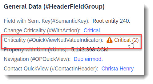
When your associated entity (QuickView entity) has a key that is non-UUID, a referential constraint for the association does not get generated automatically. To do so, a property needs to act as a null value indicator for the QuickView property, similar to a value control property, using the annotation @Semantics.nullValueIndicatorFor.
ℹ️ Source: CDS View /DMO/FSA_I_Root
define view entity /DMO/FSA_I_Root
  ...
  association [0..1] to /DMO/FSA_I_Criticality as _Criticality  on  $projection.CriticalityCode = _Criticality.Code
{

  @ObjectModel.foreignKey.association: '_Criticality'
  criticality_code          as CriticalityCode,  // Property for QuickView link

  // Search Term #QuickViewNullValueIndicator
  @Semantics.nullValueIndicatorFor: 'CriticalityCode'
  cast(' ' as abap_boolean preserving type ) as CriticalityNullValInd, // Null value indicator

  ...
}
Then setup your QuickView entity as usual.
ℹ️ Source: CDS View /DMO/FSA_I_Criticality
define view entity /DMO/FSA_I_Criticality
...
{
  // Search Term #QuickViewNullValueIndicator
  @UI.facet: [
    {
      type: #FIELDGROUP_REFERENCE,
      label: 'Criticality QuickView(#QuickViewNullValueIndicator)',
      targetQualifier: 'QuickView',
      purpose: #QUICK_VIEW
    }
  ]

  @UI: {
    fieldGroup: [
      {
        qualifier: 'QuickView',
        position: 10
      }
    ]
  }
key code  as Code,

  // Search Term #QuickViewNullValueIndicator
  @UI.fieldGroup: [
    {
      qualifier: 'QuickView',
      position: 20
    }
  ]
  descr as Description
}
And finally add your QuickView property to your app, in this example, using fieldgroup.
ℹ️ Source: Metadata Extension /DMO/FSA_C_RootTP
@UI.facet: [
  // Search Term #HeaderCollectionFacet
  {
    purpose: #HEADER,
    id: 'FacetCollection',
    type: #COLLECTION
  },
  // Search Term #HeaderFieldGroup
  {
    parentId   : 'FacetCollection',
    label      : 'General Data (#HeaderFieldGroup)',
    type       : #FIELDGROUP_REFERENCE,
    targetQualifier: 'HeaderData'
  }
]

@UI: {
  fieldGroup: [
    // Search Term #QuickViewNullValueIndicator
    {
      qualifier: 'HeaderData',
      criticality: 'CriticalityCode',
      position: 50,
      label: 'Criticality QuickView(#QuickViewNullValueIndicator)'
    }
  ]
}
CriticalityCode; // Property for QuickView link
💡 Only available with the latest SAP BTP or SAP S/4HANA Cloud, public edition release and for SAP S/4HANA, on-premise edition or SAP S/4HANA Cloud, private edition, from release 2022 onwards.
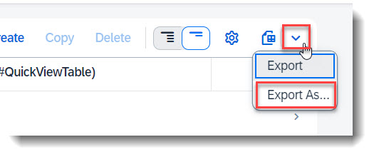
It is possible to download a copy of the records in List Report in the format PDF/A without any additional configuration. Take note that not all data types are supported, i.e. Stream properties are ignored.
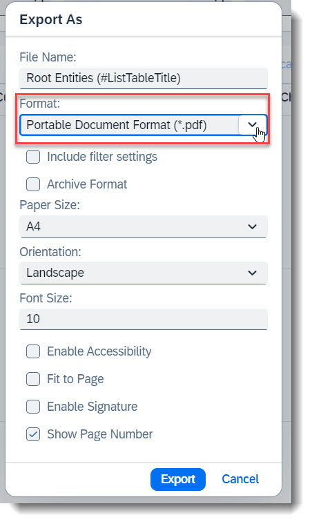
To control which columns are to be exported, first adjust your List Report View Settings and select the columns to be shown. Then click the Dropdown button, which is next to the Export File button and choose Export As..., or use the shortcut key Ctrl+Shift+E. Select the format Portable Document Format (*.pdf) in the popup box and additional settings will appear. Click the Export button to start your download.
The file will be exported to your Downloads folder for both Windows and MacOS.
Search term: #LeadingEntity
💡 Only available with the latest SAP BTP or SAP S/4HANA Cloud, public edition release and for SAP S/4HANA, on-premise edition or SAP S/4HANA Cloud, private edition, from release 2023 onwards.
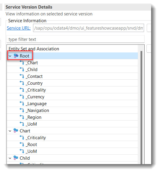
In a service definition, it is possible to annotate the leading entity of a service binding using annotation @ObjectModel.leadingEntity.name. This will make it easier for a user to find the starting node to start the app preview in a service binding. The leading node will have a tiny 'L' at the entity.
ℹ️ Source: Service Definition /DMO/UI_FeatureShowcaseApp
@ObjectModel.leadingEntity.name: '/DMO/FSA_C_RootTP'
define service /DMO/UI_FeatureShowcaseApp {
...
Search term: #FilterDefault
With the annotation @Consumption.filter.defaultValue default values can be defined. This Annotation does not allow complex values and when switching variants, the annotation is no longer considered. For complex values the @UI.selectionVariant annotation is a better solution.
ℹ️ Source: Metadata Extension /DMO/FSA_C_RootTP
@Consumption.filter.defaultValue: '3' // Search term #FilterDefault
CriticalityCode;
More information: ABAP RESTful Application Programming Model - Consumption Annotations
Search term: #HideFilter
To reduce the amount of available filters in a List Report, properties can be annotated with @Consumption.filter.hidden: true to hide them.
ℹ️ Source: Metadata Extension /DMO/FSA_C_ChartTP
//Search Term: #HideFilter
@Consumption.filter.hidden: true
AreachartTolUpperboundValue;

@Consumption.filter.hidden: true
AreachartTolLowerboundValue;

@Consumption.filter.hidden: true
AreachartDevUpperboundValue;

@Consumption.filter.hidden: true
AreachartDevLowerboundValue;
Search term: #FilterGrouping
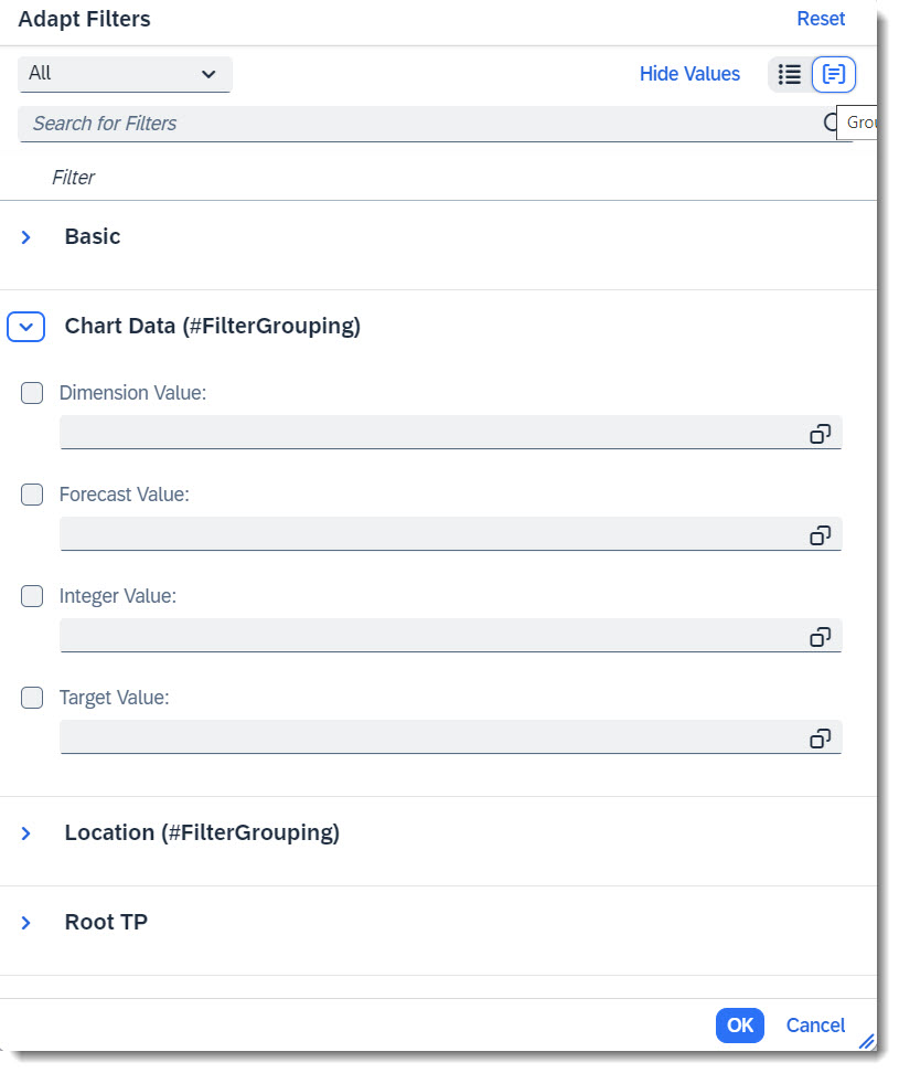
Another nice feature is filter facet, which allows one to structure the available properties of the entity into groups, so that filter adaptation is easier.
ℹ️ Source: Metadata Extension /DMO/FSA_C_RootTP
@UI.facet: [
  // Search term #FilterGrouping
  {
    purpose: #FILTER,
    type: #FIELDGROUP_REFERENCE,
    targetQualifier: 'chartData',
    label: 'Chart Data (#FilterGrouping)'
  },
  // Search term #FilterGrouping, #Location
  {
    purpose: #FILTER,
    type: #FIELDGROUP_REFERENCE,
    targetQualifier: 'location',
    label: 'Location (#FilterGrouping)'
  }
]

@UI.fieldGroup: [{ qualifier: 'chartData' }] // Search term #FilterGrouping
IntegerValue;

@UI.fieldGroup: [{ qualifier: 'chartData' }] // Search term #FilterGrouping
ForecastValue;

@UI.fieldGroup: [{ qualifier: 'chartData' }] // Search term #FilterGrouping
TargetValue;

@UI.fieldGroup: [{ qualifier: 'chartData' }] // Search term #FilterGrouping
Dimensions;
Search term: #VisibleFilters

@UI.selectionField is the annotation which allows one to specify an array of fields, which should by default be shown in the List Report filter bar as a filter, so that the user does not need to adapt the filters.
ℹ️ Source: Metadata Extension /DMO/FSA_C_RootTP
@UI.selectionField: [{ position: 10 }] // Search term #VisibleFilters
StringProperty;

@UI.selectionField: [{ position: 20 }] // Search term #VisibleFilters
FieldWithPrice;

@UI.selectionField: [{ position: 30 }] // Search term #VisibleFilters
IsoCurrency;

@UI.selectionField: [{ position: 40 }] // Search term #VisibleFilters
CriticalityCode;
More information: ABAP RESTful Application Programming Model - Adding Selection Fields
Search term: #ActionInLineItem
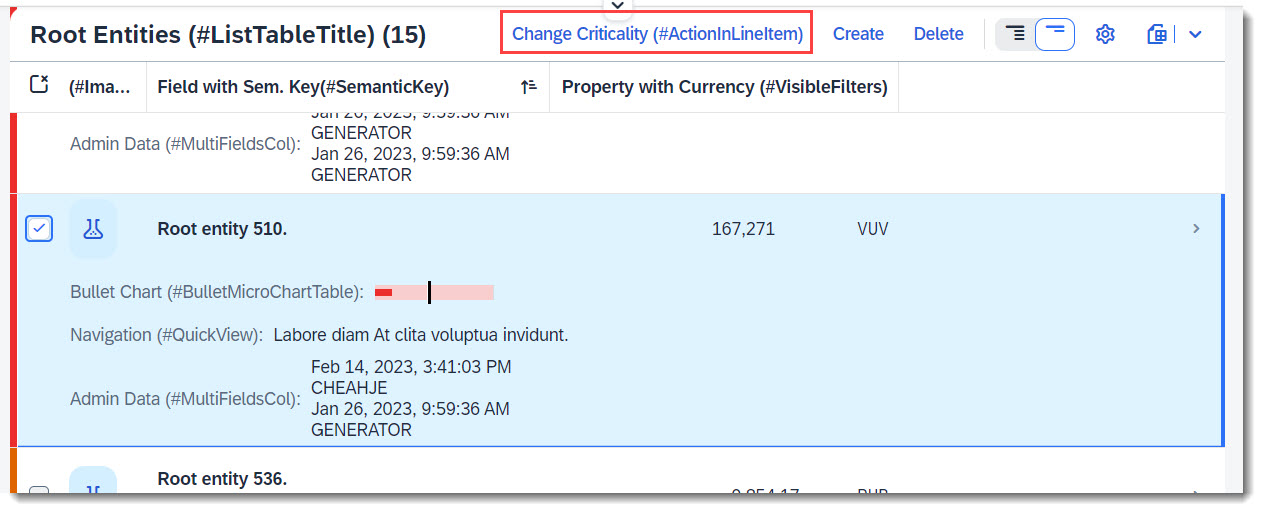
With this @UI.lineItem annotation, the action is displayed above the table on the right, with other possible actions.
ℹ️ Source: Metadata Extension /DMO/FSA_C_RootTP
// Search Term #ActionInLineItem
@UI.lineItem: [
  {
    type:#FOR_ACTION,
    label: 'Change Criticality (#ActionInLineItem)',
    dataAction: 'changeCriticality',
    position: 10
  }
]
LastChangedAt;
ℹ️ Source: Behaviour Definition /DMO/FSA_R_RootTP
action changeCriticality parameter /DMO/FSA_D_ChangeCriticalityP result [1] $self;
A regular action requires a line item to be selected before the button is activated but a static action is always active.
More information: ABAP RESTful Application Programming Model - Actions
Search term: #InlineActionInLineItem
💡 Only available with the latest SAP BTP or SAP S/4HANA Cloud, public edition release and for SAP S/4HANA, on-premise edition or SAP S/4HANA Cloud, private edition, from release 2023 onwards.
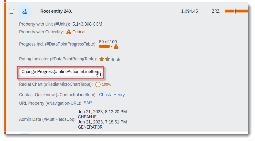
Inline actions are used to trigger actions directly for a single line item. When declaring an inline action, the action button will show up in the table row within its own column.
The keyword to use for this is inline: true in @UI.lineItem, @UI.fieldGroup, etc in conjunction with an action.
ℹ️ Source: Metadata Extension /DMO/FSA_C_RootTP
// Search Term #InlineActionInLineItem
@UI.lineItem: [
  {
    type:#FOR_ACTION,
    label: 'Change Progress(#InlineActionInLineItem)',
    dataAction: 'changeProgress',
    inline: true,
    emphasized: true,
    importance: #HIGH,
    position: 100
  }
]
LastChangedAt;
ℹ️ Source: Behaviour Definition /DMO/FSA_R_RootTP
action changeProgress parameter /DMO/FSA_D_ChangeProgressP result [1] $self;
Search term: #CopyActionInLineItem
💡 Only available with the latest SAP BTP or SAP S/4HANA Cloud, public edition release and for SAP S/4HANA, on-premise edition or SAP S/4HANA Cloud, private edition, from release 2023 onwards.

For a deep copy of an instance, the RAP framework does not provide a copy action out of the box, unlike create/edit/delete. However you can define a factory action in the BDEF that copies an instance, and by using the keyword isCopyAction: true, the action button will be rendered in UI harmoniously with Create/Delete. When no label is provided, it is automatically set to 'Copy'.
The cardinality of a factory action is always [1], that means, only one instance can be copied at a time.
When used in conjunction with inline: true to render the Copy button at individual line items, a label must be provided by you.
ℹ️ Source: Metadata Extension /DMO/FSA_C_RootTP
// Search Term #CopyActionInLineItem
@UI.lineItem: [
  {
    type:#FOR_ACTION,
    dataAction: 'copyInstance',
    isCopyAction: true
  }
]
LastChangedAt;
ℹ️ Source: Behaviour Definition /DMO/FSA_R_RootTP
factory action copyInstance [1];
Search term: #Navigation-IBN
An action navigating to a published app of an associated entity can be added, through Intent Based Navigation using @UI.lineItem. When the navigation is setup properly, a button will be rendered at the table toolbar. Since this feature requires Fiori Launchpad and a destination app that has been published, the following is just an example of how it can be coded, as this navigation does not work in a FE App Preview.
Here "FeatureShowcaseNavigation" is the semantic object to be referenced.
ℹ️ Source: Metadata Extension /DMO/FSA_C_RootTP
// Search Tern #Navigation-IBN
@Consumption.semanticObject: 'FeatureShowcaseNavigation'
@UI.lineItem: [
  {
    label: 'IntentBased Navigation (#NavAction-IBN)',
    type: #FOR_INTENT_BASED_NAVIGATION,
    semanticObjectAction: 'manage',
    requiresContext: true
  }
]
NavigationID;
More information: ABAP RESTful Application Programming Model - Based on Intent
Search term: #WithActionInLineItem
💡 Only available with the latest SAP BTP or SAP S/4HANA Cloud, public edition release and for SAP S/4HANA, on-premise edition or SAP S/4HANA Cloud, private edition, from release 2023 onwards.
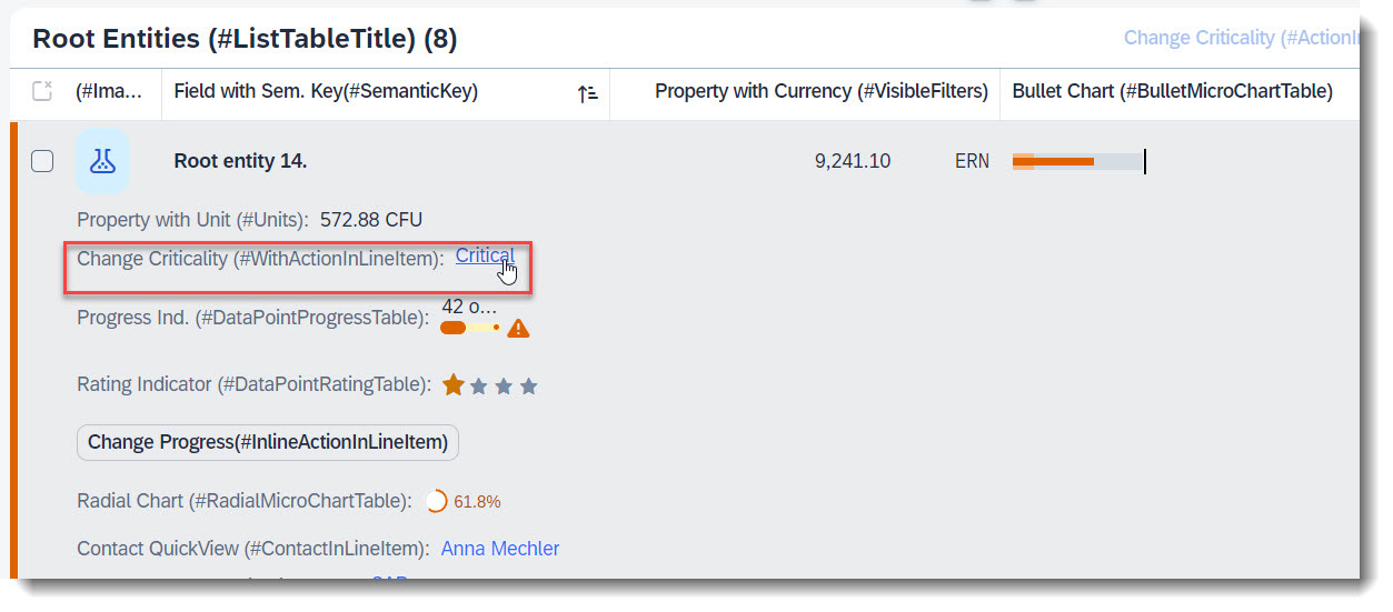
An action that is tied to a data value, which would be rendered as a hyperlink. Therefore it is crucial to specify the annotation at the desired element which has the data value.
The keyword to use for this is type: #WITH_ACTION.
ℹ️ Source: Metadata Extension /DMO/FSA_C_RootTP
@UI: {
  lineItem: [
    {
      position: 50,
      criticality: 'CriticalityCode',
      label: 'Change Criticality (#WithActionInLineItem)',
      type: #WITH_ACTION,
      dataAction: 'changeCriticality',
      importance: #LOW
    }
  ]
}
FieldWithCriticality;
ℹ️ Source: Behaviour Definition /DMO/FSA_R_RootTP
action changeCriticality parameter /DMO/FSA_D_ChangeCriticalityP result [1] $self;
Search term: #PresentationVariant
A presentation variant defines how the result of a queried collection of entities is shaped and how this result is displayed, for example as a list report or a chart (@UI.presentationVariant.visualizations), the sorting order (@UI.presentationVariant.sortOrder), or the number of items (@UI.presentationVariant.maxItems) to display per segment.
ℹ️ Source: Metadata Extension /DMO/FSA_C_RootTP
// Search Term #PresentationVariant
@UI.presentationVariant: [
  {
    qualifier: 'pvariant',
    maxItems: 5,
    // Search Term #DefaultSort
    sortOrder: [
      {
        by: 'StringProperty',
        direction: #ASC
      }
    ],
    visualizations: [{type: #AS_LINEITEM}]
  }
]
Search term: #SelectionVariant
With a selection variant, you can define how the properties of an entity set should be filtered. The attribute text of the annotation is the title of the view and the attribute filter contains all filter parameters.
ℹ️ Source: Metadata Extension /DMO/FSA_C_RootTP
// Search Term #SelectionVariant
@UI.selectionVariant: [
  {
    qualifier: 'svariant',
    text: 'Selection (Criticality between 0 and 2)',
    filter: 'CriticalityCode GE 0 and CriticalityCode LE 2'
  }
]
Search term: #SelectionPresentationVariant
A SelectionPresentationVariant bundles a Selection Variant and a Presentation Variant.
ℹ️ Source: Metadata Extension /DMO/FSA_C_RootTP
@UI.presentationVariant: [
  {
    qualifier: 'pvariant',
    maxItems: 5,
    // Search Term #DefaultSort
    sortOrder: [
      {
        by: 'StringProperty',
        direction: #ASC
      }
    ],
    visualizations: [{type: #AS_LINEITEM}]
  }
]

@UI.selectionVariant: [
  {
    qualifier: 'svariant',
    text: 'Selection (Criticality between 0 and 2)',
    filter: 'CriticalityCode GE 0 and CriticalityCode LE 2'
  }
]

// Search Term #SelectionPresentationVariant
@UI.selectionPresentationVariant: [
  {
    text: 'SPresVariant (Criticality between 0 and 2)',
    presentationVariantQualifier: 'pvariant',
    selectionVariantQualifier: 'svariant'
  }
]
Search term: #DefaultSort
Use the @UI.presentationVariant annotation to define a default sort order. The attribute by defines, on which property the sort order should be applied.
Without a sort order defined with direction, the values are ascending.
ℹ️ Source: Metadata Extension /DMO/FSA_C_RootTP
@UI.presentationVariant: [
  {
    // Search Term #DefaultSort
    sortOrder: [
      {
        by: 'StringProperty',
        direction: #ASC
      }
    ]
  }
]
Search term: #LineItemHighlight
Line items can be highlighted based on criticality. The @UI.lineItem annotation should be annotated at Entity level.
ℹ️ Source: Metadata Extension /DMO/FSA_C_RootTP
// Search Term #LineItemHighlight
@UI.lineItem: [{criticality: 'CriticalityCode'}] // Annotation, so that the line item row has a criticality
Search term: #DataPointRatingTable
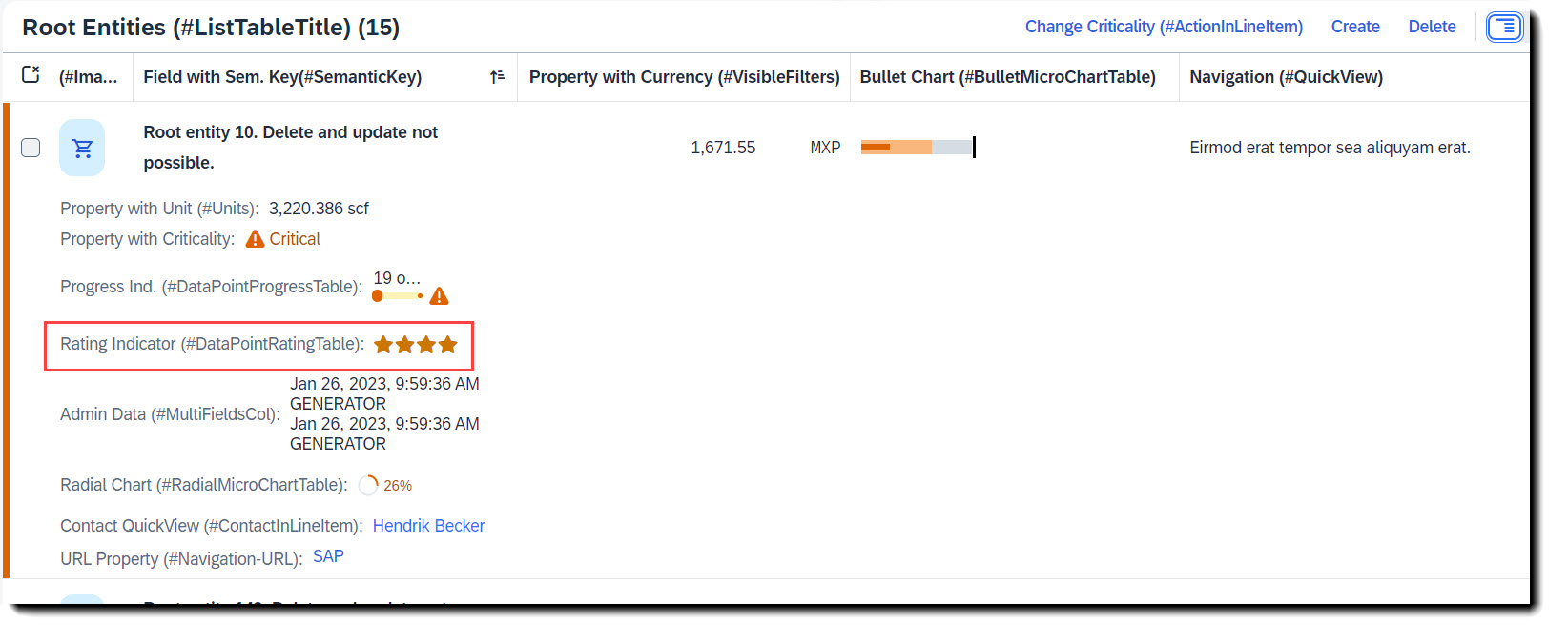
To add a rating indicator (stars) to the table, you first need to define a datapoint with @UI.dataPoint. The property where datapoint is defined sets how many stars are visible. Values between x.25 and x.74 are displayed as a half star. The attribute targetValue defines how many stars are possible. Most importantly, the qualifier needs to match the property name.
To show it in the table, @UI.lineItem annotation is needed.
ℹ️ Source: Metadata Extension /DMO/FSA_C_RootTP
@UI: {
  // Search Term #DataPointRating, #DataPointRatingTable
  dataPoint: {
    qualifier: 'StarsValue',
    targetValue: 4,
    visualization: #RATING,
    title: 'Rating Indicator (#DataPointRating)'
  },
  // Search Term #DataPointRatingTable
  lineItem: [
    {
      type: #AS_DATAPOINT,
      label: 'Rating Indicator (#DataPointRatingTable)',
      importance: #LOW,
      position: 70
    }
  ]
}
StarsValue;
Example: ABAP RESTful Application Programming Model - Develop Node Extensions - Extension Node with Rating
Search term: #DataPointProgressTable
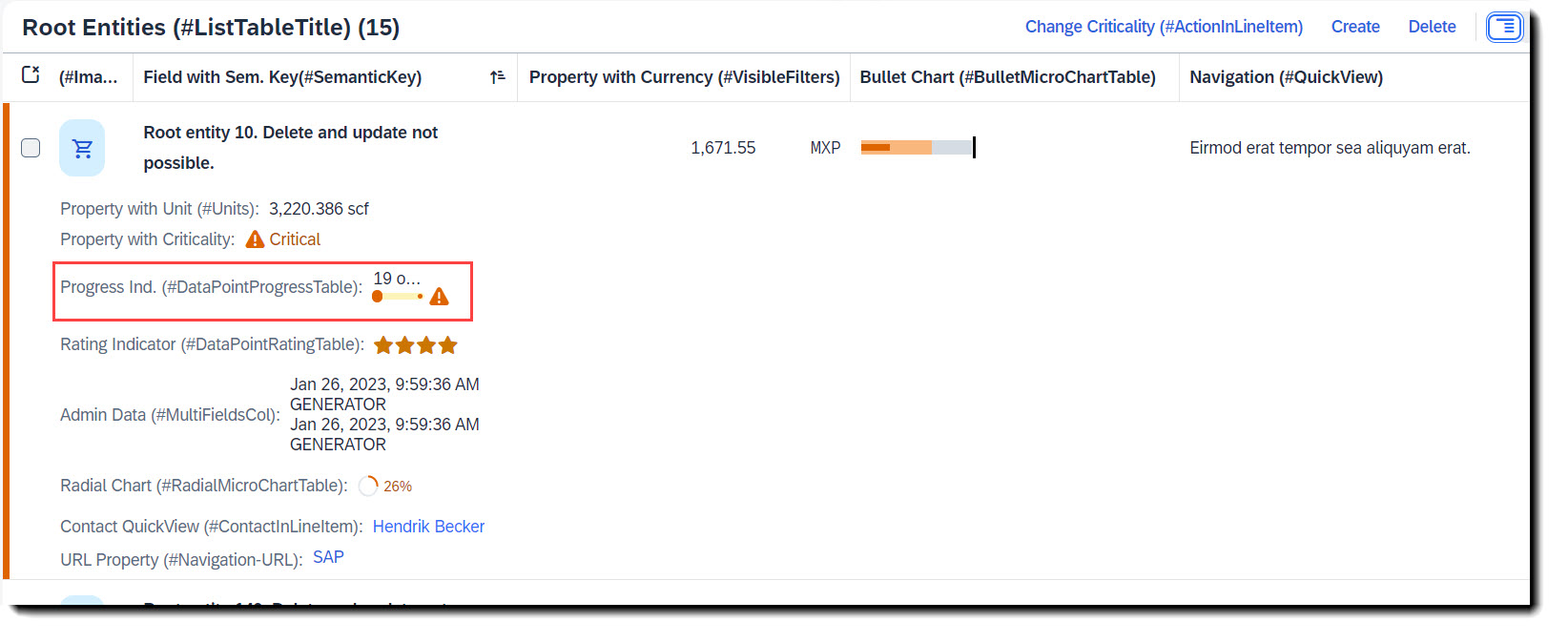
To add a progress indicator to the table, you first need to define a datapoint with @UI.dataPoint. The property where datapoint is defined sets the current progress and the attribute targetValue, the maximum progress. Additionally, a criticality can be given, if wanted. Most importantly, the qualifier needs to match the property name.
To show it in the table, @UI.lineItem annotation is needed.
ℹ️ Source: Metadata Extension /DMO/FSA_C_RootTP
// Search Term #DataPointProgress, #DataPointProgressTable
@UI: {
  dataPoint: {
    qualifier: 'ProgressIntegerValue',
    targetValue: 100,
    visualization: #PROGRESS,
    criticality: 'CriticalityCode',
    title: 'Progress Indicator (#DataPointProgress)'
  },
  // Search Term #DataPointProgressTable
  lineItem: [
    {
      type:#AS_DATAPOINT,
      label: 'Progress Ind. (#DataPointProgressTable)',
      importance: #LOW,
      position: 60
    }
  ]
}
ProgressIntegerValue;
Example: ABAP RESTful Application Programming Model - Develop Node Extensions - Extension Node with Progress
Search term: #BulletMicroChartTable
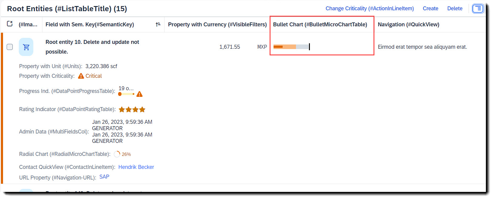
To add a bullet micro chart to a table you have to first define a data point at the property where the value is to be taken from, which is the actual bar. The following attributes are also mandatory: minimumValue to render the chart properly, forecastValue for the bar in the background with a lower opacity, targetValue (or targetValueElement) for the dark line and qualifier (qualifier must be set to the name of the property). Criticality is optional.
To show the chart, the property must then be annotated with @UI.lineItem.
ℹ️ Source: Metadata Extension /DMO/FSA_C_RootTP
/// Search Term: #BulletMicroChart, #BulletMicroChartTable
@UI: {
  dataPoint: {
    qualifier: 'IntegerValue', //IntegerValue: horizontal bar in relation to the goal line
    targetValueElement: 'TargetValue', //visual goal line in the UI
    forecastValue: 'ForecastValue', //horizontal bar behind the value bar with, slightly larger with higher transparency
    criticality: 'CriticalityCode',
    minimumValue: 0 //Minimal value, needed for output rendering
  },
  // Search Term #BulletMicroChartTable
  lineItem: [{
    type:#AS_CHART,
    label: 'Bullet Chart (#BulletMicroChartTable)',
    valueQualifier: 'bulletChart',
    importance: #HIGH,
    position: 80
  }]
}
IntegerValue;
The data point needs to be referenced in a @UI.chart annotation in the measure attributes. The chartType must have value #BULLET for a bullet chart, attributes measures and measureAttributes are mandatory.
// Search Term #BulletMicroChart, #BulletMicroChartTable
@UI.chart: [
  {
    qualifier: 'bulletChart',
    title: 'Bullet Micro Chart (#BulletMicroChart)',
    description: 'This is a micro chart',
    chartType: #BULLET,
    measures: ['IntegerValue'],
    measureAttributes: [
      {
        measure: 'IntegerValue',
        role: #AXIS_1,
        asDataPoint: true
      }
    ]
  }
]
Search term: #RadialMicroChartTable
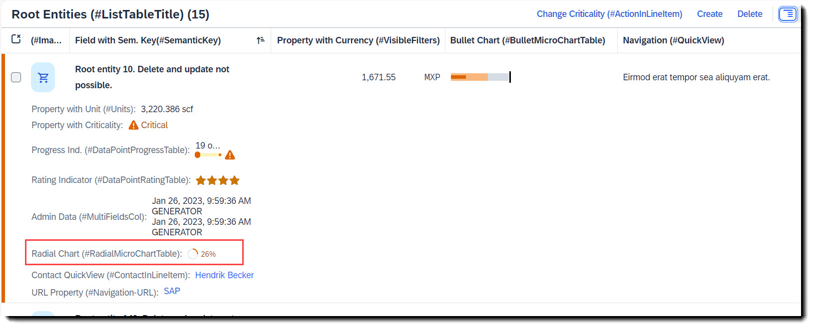
To add a radial micro chart to a table you have to first define a data point at the property where the value is to be taken from. The percentage value is the fraction of the property value and the target value, which is set in attribute targetValue (or targetValueElement). Both criticality and criticalityCalculation are supported, but if both are given criticality overrides criticalityCalculation. Qualifier must be set to the name of the property.
To show the chart, the property must then be annotated with @UI.lineItem.
ℹ️ Source: Metadata Extension /DMO/FSA_C_RootTP
// Search Term #RadialMicroChart, #RadialMicroChartTable
@UI: {
  dataPoint: {
    qualifier: 'RadialIntegerValue',
    targetValueElement: 'TargetValue', //The relation between the value and the target value will be displayed as a percentage
    criticality: 'CriticalityCode'
  },
  // Search Term #RadialMicroChartTable
  lineItem: [
    {
      type: #AS_CHART,
      label: 'Radial Chart (#RadialMicroChartTable)',
      valueQualifier: 'radialChart',
      position: 110
    }
  ]
}
RadialIntegerValue;
The data point needs to be referenced in a @UI.chart annotation in the measure attributes. The chartType must have value #Donut for a radial chart, attributes measures and measureAttributes are mandatory.
// Search Term #RadialMicroChart, #RadialMicroChartTable
@UI.chart: [
  {
    qualifier: 'radialChart',
    title: 'Radial Micro Chart (#RadialMicroChart)',
    description: 'This is a micro chart',
    chartType: #DONUT,
    measures: ['RadialIntegerValue'],
    measureAttributes: [
      {
        measure: 'RadialIntegerValue',
        role: #AXIS_1,
        asDataPoint: true
      }
    ]
  }
]
Search term: #ContactInHeader, #ContactInLineItem, #Contact
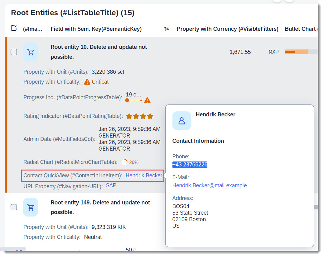
To have a data field which shows a contact with a contact quick view, the contact quick view needs to be implemented first. An example would be:
ℹ️ Source: CDS View /DMO/FSA_I_Contact
// Search Term #Contact
define view entity /DMO/FSA_I_Contact
{
      @ObjectModel.text.element: ['Name'] // Search Term #DisplayTextAndID
  key id            as ID,

      @Semantics.name.fullName: true
      name          as Name,

      @Semantics.telephone.type: [#PREF]
      phone         as Phone,

      @Semantics.address.country: true
      country       as Country,

      @Semantics.address.street: true
      street        as Street,

      @Semantics.address.city: true
      city          as City,

      @Semantics.address.zipCode: true
      postcode      as Postcode,

      @Semantics.address.label: true
      address_label as AddressLabel
}
To show the contact card in the table you need to annotate the contact property with @UI.lineItem or if in a facet, with @UI.fieldGroup.
ℹ️ Source: Metadata Extension /DMO/FSA_C_RootTP
@UI.facet: [
  {
    purpose    : #HEADER, // or #STANDARD
    label      : 'General Data (#HeaderFieldGroup)',
    type       : #FIELDGROUP_REFERENCE,
    targetQualifier: 'HeaderData'
  }
]

// Search Term #ContactInHeader
@UI.fieldGroup: [
  {
    qualifier: 'HeaderData',
    type: #AS_CONTACT,
    label: 'Contact QuickView (#ContactInHeader)',
    position: 70,
    value: '_Contact'
  }
]

// Search Term #ContactInLineItem
@UI.lineItem: [
  {
    type:#AS_CONTACT,
    label: 'Contact QuickView (#ContactInLineItem)',
    value: '_Contact',
    position: 120
  }
]
ContactID;
More Information: ABAP RESTful Application Programming Model - Contact Data
Search term: #QuickViewTable
💡 Only available with the latest SAP BTP or SAP S/4HANA Cloud, public edition release and for SAP S/4HANA, on-premise edition or SAP S/4HANA Cloud, private edition, from release 2023 onwards.
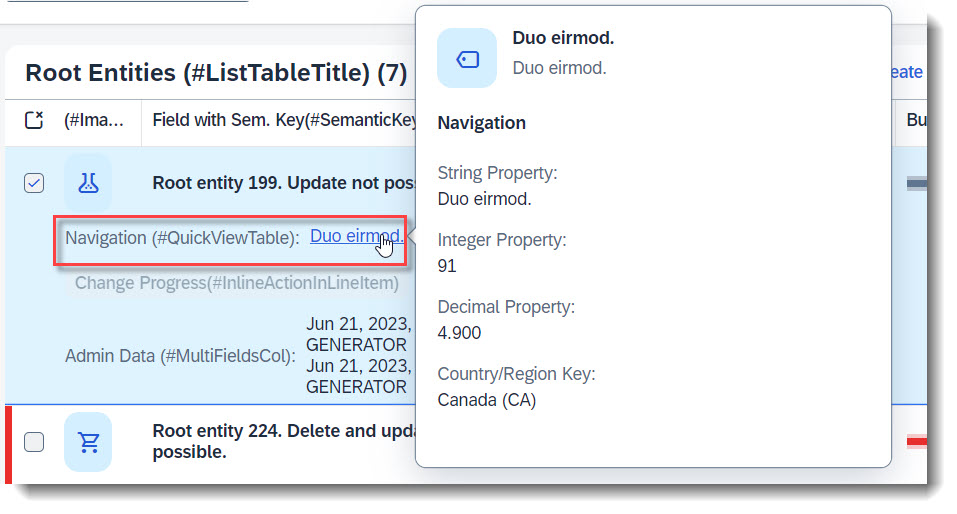
A quick view is a pop up that shows more information, when you click on an entry in a column or an object page. Typically, it is used in combination with one-to-one or zero-to-one associations. By clicking on the link, more information about the associated entity can be displayed.
To set up an entity as QuickView, follow the steps here: Setting up QuickView
To show the QuickView in a table, just use annotation @UI.lineItem to add the property, with has referential constraint defined, into the table.
// Search Tern #QuickViewTable
@UI.lineItem: [
  {
    label: 'Navigation (#QuickViewTable)',
    importance: #HIGH,
    position: 90
  }
]
NavigationID;
Search term: #MultiFieldsCol
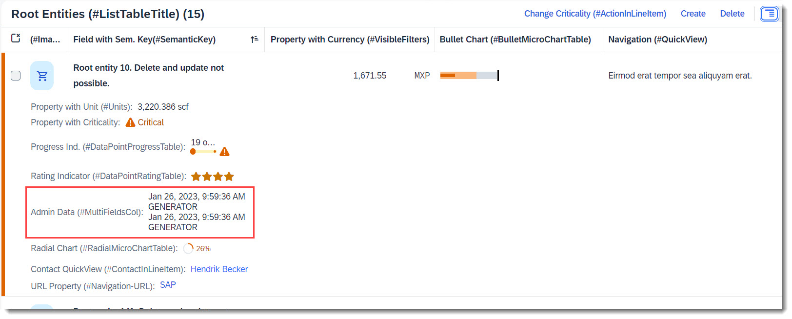
Multiple fields can be shown in one column, if a field group is added to line item (with annotations @UI.lineItem and @UI.fieldGroup). First you must define the field group and secondly the line item.
ℹ️ Source: Metadata Extension /DMO/FSA_C_RootTP
@UI.fieldGroup: [{ qualifier: 'AdminData' }] // Search Term #MultiFieldsCol
CreatedAt;

@UI.fieldGroup: [{ qualifier: 'AdminData' }] // Search Term #MultiFieldsCol
LocalLastChangedBy;

@UI.fieldGroup: [{ qualifier: 'AdminData' }] // Search Term #MultiFieldsCol
LocalLastChangedAt;

// Search Term #MultiFieldsCol
@UI: {
  fieldGroup: [{ qualifier: 'AdminData' }],
  lineItem: [
    {
      type: #AS_FIELDGROUP,
      label: 'Admin Data (#MultiFieldsCol)',
      valueQualifier: 'AdminData',
      importance: #HIGH,
      position: 100
    }
  ]
}
CreatedBy;
Search term: #Image
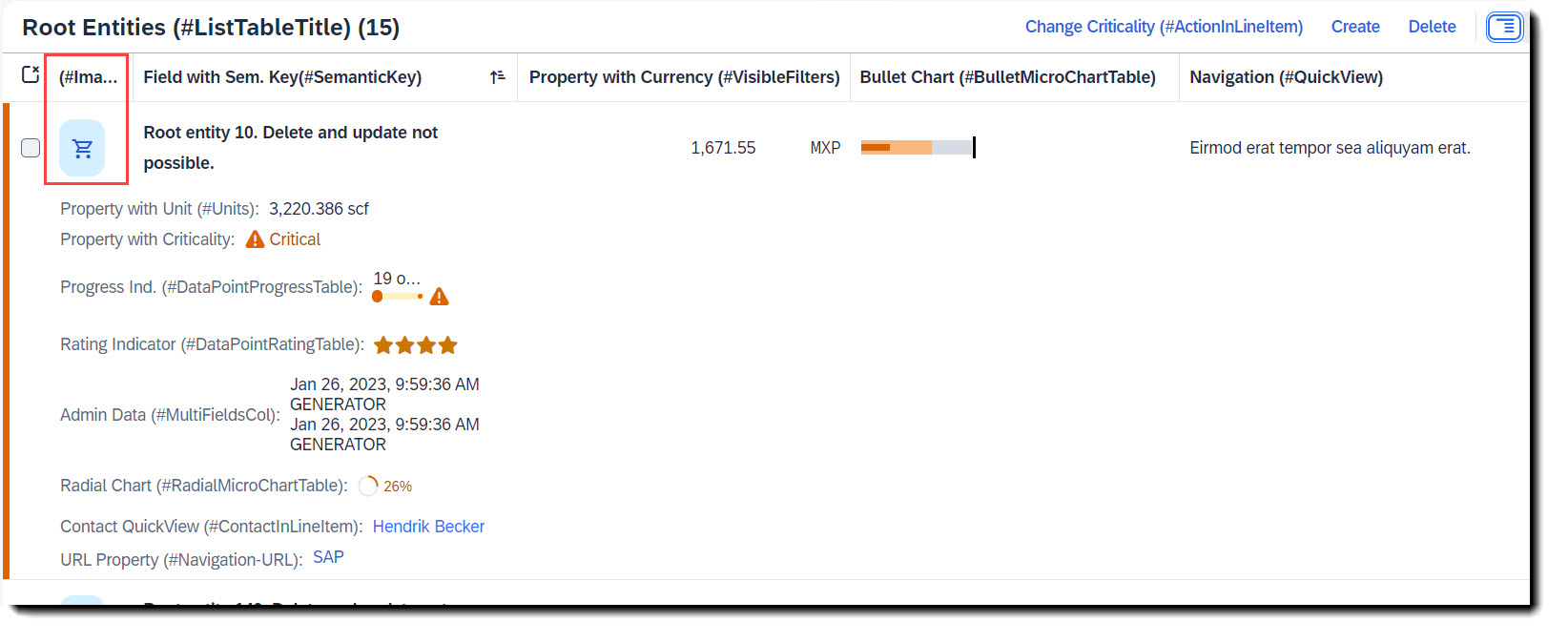
Images are typically the first column in a table and help to visually guide the user. An image can be added to a table by just adding a normal property to the line items.
ℹ️ Source: Metadata Extension /DMO/FSA_C_RootTP
// Search Term #Image
@UI.lineItem: [
  {
    cssDefault.width: '5em',
    position: 10,
    importance: #HIGH,
    label: '(#Image)'
  }
]
@EndUserText.quickInfo: '(#Image)'
ImageUrl;
The property which contains the image url has to, additionally, be annotated with @Semantics.imageURL: true.
ℹ️ Source: CDS View /DMO/FSA_I_Root
@Semantics.imageUrl: true
image_url                 as ImageUrl,
Search term: #Units
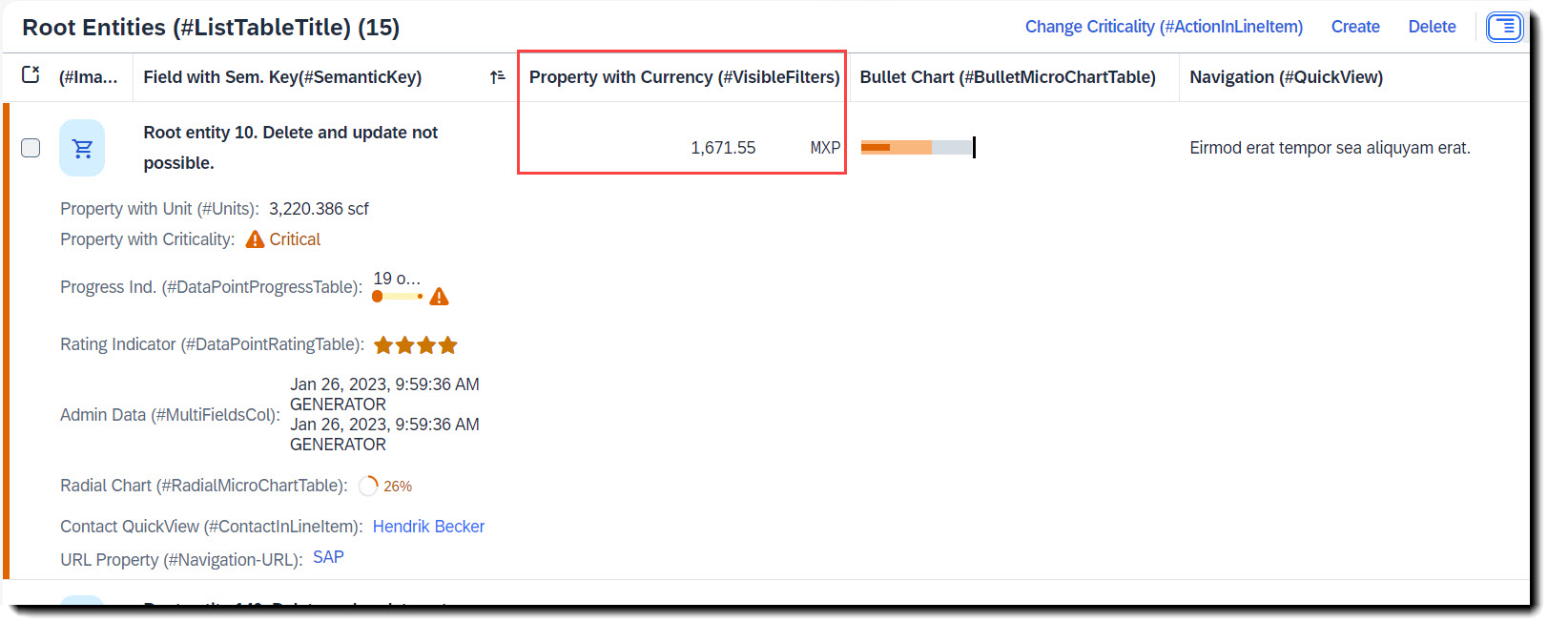
The special thing about quantity or price properties, is that they have an additional property of unit/currency. The property containing the quantity/price should be linked with the property for unit/currency. For units of measure the annotation is @Semantic.quantity.unitOfMeasure and for currency, it is @Semantic.amount.currencyCode.
ℹ️ Source: CDS View /DMO/FSA_I_Root
// Search Term #Units
@Semantics.quantity.unitOfMeasure: 'Uom'
field_with_quantity       as FieldWithQuantity,

// Search Term #Units
@Semantics.amount.currencyCode: 'IsoCurrency'
field_with_price          as FieldWithPrice,
More Information: ABAP RESTful Application Programming Model - Interaction with Other Annotations
Search term: #Stream, #StreamTable
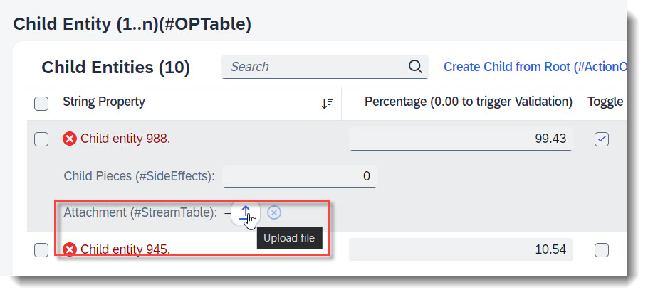
You can enable your RAP application for maintaining large objects (LOBs). By doing so, you provide end users the option to incorporate external binary files or text files when editing entity instances. First the appropriate fields should be added into the database table and the CDS view, and also the annotations @Semantics.largeObject and @Semantics.mimeType. To show it in a table, you will need annotation @UI.lineItem. Lastly, you should also update the mapping and the draft table in your behaviour definition.
ℹ️ Source: Database Table /DMO/FSA_ChildA
stream_filename    : abap.char(128);
stream_mimetype    : abap.char(128);
stream_file        : abap.rawstring(0);
ℹ️ Source: CDS View /DMO/FSA_C_ChildTP
StreamFilename, // Search Term #Stream

// Search Term #Stream
@Semantics.largeObject: {
  acceptableMimeTypes: [ 'image/*', 'application/*' ],
  cacheControl.maxAge: #MEDIUM,
  contentDispositionPreference: #INLINE, // #ATTACHMENT - download as file
                                             // #INLINE - open in new window
  fileName: 'StreamFilename',
  mimeType: 'StreamMimeType'
}
StreamFile,

// Search Term #Stream
@Semantics.mimeType: true
StreamMimeType,
ℹ️ Source: Metadata Extension /DMO/FSA_C_ChildTP
// Search Term #Stream
@UI.hidden: true
StreamMimeType;

@UI.lineItem: [{ position: 40, label: 'Attachment (#StreamTable)' }] // Search Term #StreamTable
StreamFile;

// Search Term #Stream
@UI.hidden: true
StreamFilename;
ℹ️ Source: BDEF /DMO/FSA_R_ROOTTP
define behavior for /DMO/FSA_R_ChildTP alias Child {
...
mapping for /dmo/fsa_child_a {
  ..
  StreamFile = stream_file;
  StreamFilename = stream_filename;
  StreamMimeType = stream_mimetype;
}
More Information: ABAP RESTful Application Programming Model - Working with Large Objects
Search term: #Navigation-URL
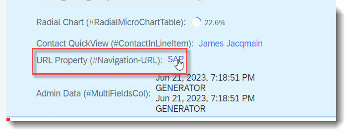
You can set the text of a property as a link to an external website using the annotation @UI.lineItem.type: #WITH_URL.
ℹ️ Source: Metadata Extension /DMO/FSA_C_RootTP
// Search Term #Navigation-URL
@UI.lineItem: [
  {
    url: 'FieldWithUrl', //Target, when pressing the text
    label: 'URL Property (#Navigation-URL)',
    type: #WITH_URL,
    importance: #MEDIUM,
    position: 130
  }
]
FieldWithUrlText;
More Information: ABAP RESTful Application Programming Model - With URL
Search term: #CommunicationFields
To display emails and phone numbers as a link, they are annotated with @Semantics.email.address: true or @Semantics.telephone.type
ℹ️ Source: CDS View /DMO/FSA_I_Root
// Search Term #CommunicationFields
@Semantics.eMail.address: true
email                     as Email,

// Search Term #CommunicationFields
@Semantics.telephone.type: [#CELL]
telephone                 as Telephone,
ℹ️ Source: Metadata Extension /DMO/FSA_C_RootTP
// Search Term #Communication
@UI.facet: [
  {
    purpose: #HEADER, // or #STANDARD
    label      : 'Communication Subsection(#Communication)',
    type       : #FIELDGROUP_REFERENCE,
    targetQualifier: 'communication'
  }
]

@UI.fieldGroup: [{ qualifier: 'communication' }] // Search Term #Communication
Email;

@UI.fieldGroup: [{ qualifier: 'communication' }] // Search Term #Communication
Telephone;
More Information: ABAP RESTful Application Programming Model - Contact Data
Search term: #TimeAndDate
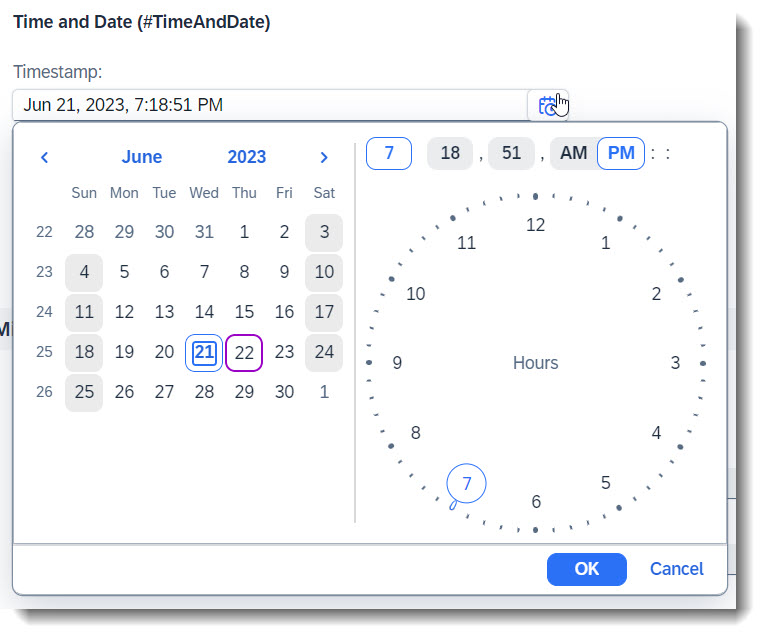
SAP Fiori Elements provides out of the box support for displaying and editing dates and times, as well as time stamps. No additional annotations are needed, the properties just need to have the corresponding data types.
The following annotations are used in the app, in order to group the time and date fields and show them in a facet.
ℹ️ Source: Metadata Extension /DMO/FSA_C_RootTP
// Search Term #TimeAndDate
@UI.facet: [
  {
    purpose: #HEADER, // or #STANDARD
    label      : 'Time and Date (#TimeAndDate)',
    type       : #FIELDGROUP_REFERENCE,
    targetQualifier: 'timeAndDate'
  }
]

@UI.fieldGroup: [{ qualifier: 'timeAndDate' }] // Search Term #TimeAndDate
ValidTo;

@UI.fieldGroup: [{ qualifier: 'timeAndDate' }] // Search Term #TimeAndDate
Time;

@UI.fieldGroup: [{ qualifier: 'timeAndDate' }] // Search Term #TimeAndDate
Timestamp;
Search term: #MultiLineText
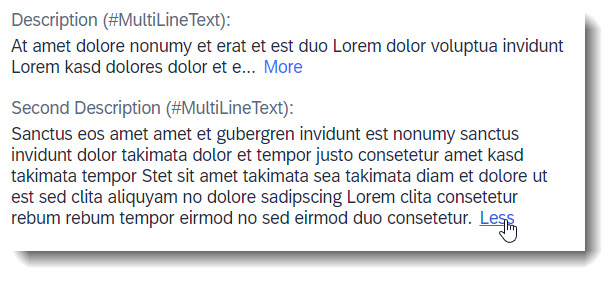
With the annotation @UI.multiLineText longer strings are displayed in multiple lines.
ℹ️ Source: Metadata Extension /DMO/FSA_C_RootTP
@UI.multiLineText: true // Search Term #MultiLineText
Description;

@UI.multiLineText: true // Search Term #MultiLineText
DescriptionCustomGrowing;
More Information: ABAP RESTful Application Programming Model - Multi-Line Text
Search term: #CollectiveValueHelp
For SAP GUI-based applications it is possible to define a collective search help that combines several elementary search helps. You can choose one of several alternative search paths and retrieve input values from multiple sources/tables in a single dialog. In Fiori UI this is also possible via a collective value help using an abstract entity comprising a list of assigned elementary search helps and potential mappings of the bound field names.
The collective value help shall be annotated with @ObjectModel.collectiveValueHelp.for.element pointing to the field, for which the collective value help is defined. The field referenced by @ObjectModel.collectiveValueHelp.for.element shall be assigned at least a single elementary value help using annotation @Consumption.valueHelpDefinition.
Only the following keywords can be used for a collective value help: entity.name, entity.element, additionalBinding.localElement, additionalBinding.element and qualifier.
ℹ️ Source: CDS Abstract Entity /DMO/FSA_D_CountryCVH
@EndUserText.label: 'Country Collective Value Help'
@ObjectModel.supportedCapabilities:[#COLLECTIVE_VALUE_HELP]
@ObjectModel.modelingPattern:#COLLECTIVE_VALUE_HELP
@ObjectModel.collectiveValueHelp.for.element: 'Country'

// Search Term #CollectiveValueHelp
define abstract entity /DMO/FSA_D_CountryCVH
{
  @Consumption.valueHelpDefinition:[
    // 'Default' VH
    {
      entity: { name:'I_Country' },
      label: 'Search by Country'
    },
    // additional VH, set qualifier
    {
      entity: { name:'/DMO/FSA_I_ContactVH',
                element:'Country' },
      label: 'Search by Contact',
      qualifier: 'ContactSearch'
    },
    // additional VH, set qualifier
    {
      entity: { name:'I_RegionVH',
                element:'Country' },
      additionalBinding: [{ localElement:'Region',
                            element:'Region'  }],
      label: 'Search by Region',
      qualifier:  'RegionSearch'
    }
  ]
  Country : land1;
  Region  : regio;
}
The consumer view of the collective value help has to define the same fields, that are used in the collective value help definition (respectively bind all corresponding local fields via @Consumption.valueHelpDefinition.additionalBinding... to the collective value help fields).
ℹ️ Source: CDS View /DMO/FSA_R_RootTP
// Search Term #CollectiveValueHelp
@Consumption.valueHelpDefinition: [{ entity: { name: '/DMO/FSA_D_CountryCVH',  element: 'Country' },
                                      additionalBinding: [{ element: 'Region',
                                                            localElement: 'Region' }]  }]
Country,
...
Region,
Search term: #SideEffects, #SideEffectsSection
💡 Only available with the latest SAP BTP or SAP S/4HANA Cloud, public edition release and for SAP S/4HANA, on-premise edition or SAP S/4HANA Cloud, private edition, from release 2023 onwards.
Side Effects annotations specify to the UI, which targets to be refreshed in order to show updated values that arises from field changes, actions, or determine actions. Side effects are defined in the behaviour definition. There are a variety of ways to annotate side effects by combining the triggers and the affected components, and a few examples are shown in the app:
projection...

use side effects;
define behavior for ProjectionView {
}
Fields from same level entity
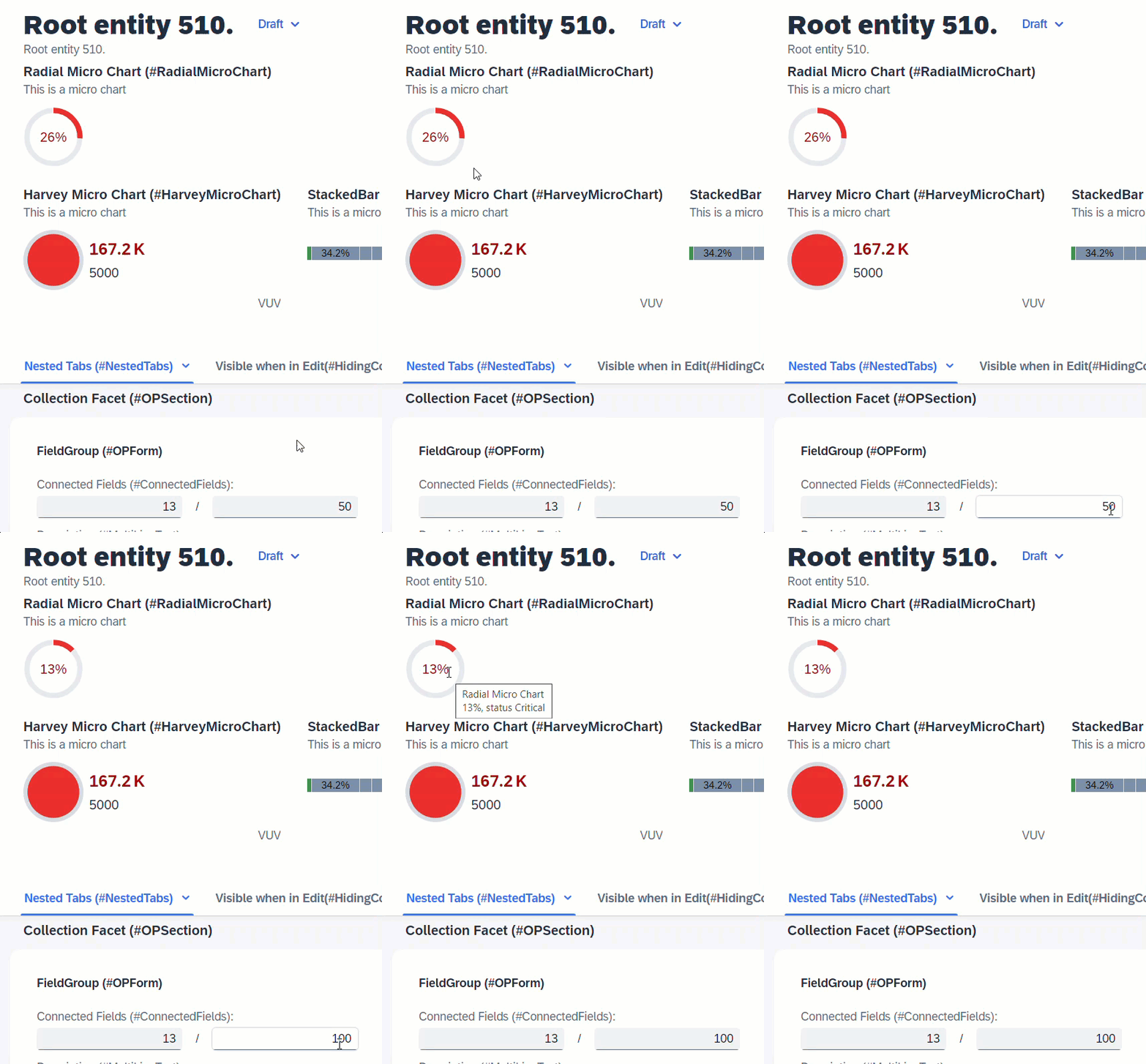
When the user changes the value of IntegerValue, the determination setIntegerValue is called and modifies the values of ProgressIntegerValue and RadialIntegerValue. In order for these 2 fields to show the updated values without a refresh, side effects is required to request UI to reload these 2 fields.
ℹ️ Source: Behaviour Definition /DMO/FSA_R_RootTP
define behavior for /DMO/FSA_R_RootTP alias Root
...
{
  determination setIntegerValue on modify { field IntegerValue; }

  side effects {
    field IntegerValue affects field ProgressIntegerValue, field RadialIntegerValue;
  }
}
Fields from associated entity
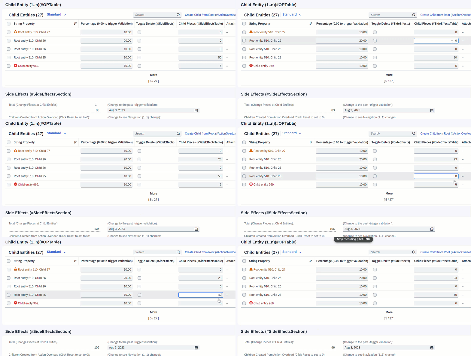
It is also possible to define as target, a field from an assoicated entity. When the field ChildPieces in Child entity is modified, this will trigger the determination calculateTotalPieces to total up the pieces of all child instances. Side effects will trigger the refresh of field TotalPieces from the Root entity to show the calculated total every time user enters a value at the child instance.
ℹ️ Source: Behaviour Definition /DMO/FSA_R_RootTP
define behavior for /DMO/FSA_R_ChildTP alias Child
persistent table /dmo/fsa_child_a
draft table /dmo/fsa_child_d
lock dependent by _Root
authorization dependent by _Root
{
  determination calculateTotalPieces on modify { field ChildPieces; }

  side effects {
    field ChildPieces affects field _Root.TotalPieces;
  }
}
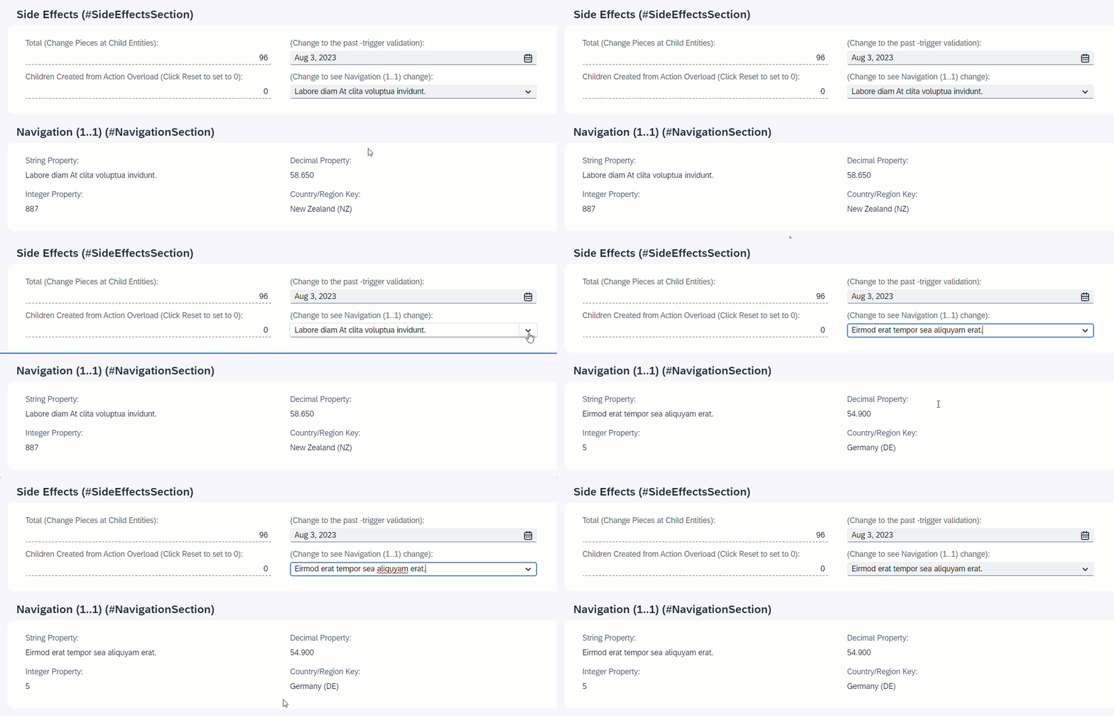
When NavigationID is changed, the associated entity _Navigation will reload and all fields of the association will change.
ℹ️ Source: Behaviour Definition /DMO/FSA_R_RootTP
define behavior for /DMO/FSA_R_RootTP alias Root
...
{
  side effects {
    field NavigationID affects entity _Navigation;
  }
}

When resetTimesChildCreated is executed, the field TimesChildCreated will be set to 0.
ℹ️ Source: Behaviour Definition /DMO/FSA_R_RootTP
define behavior for /DMO/FSA_R_RootTP alias Root
...
{
  action ( features : instance ) resetTimesChildCreated;

  side effects {
    action resetTimesChildCreated affects field TimesChildCreated;
  }
}

When resetTimesChildCreated is executed, instance feature control will disable the action button resetTimesChildCreated.
ℹ️ Source: Behaviour Definition /DMO/FSA_R_RootTP
define behavior for /DMO/FSA_R_RootTP alias Root
...
{
  action ( features : instance ) resetTimesChildCreated;

  side effects {
    action resetTimesChildCreated affects permissions ( action resetTimesChildCreated );
  }
}
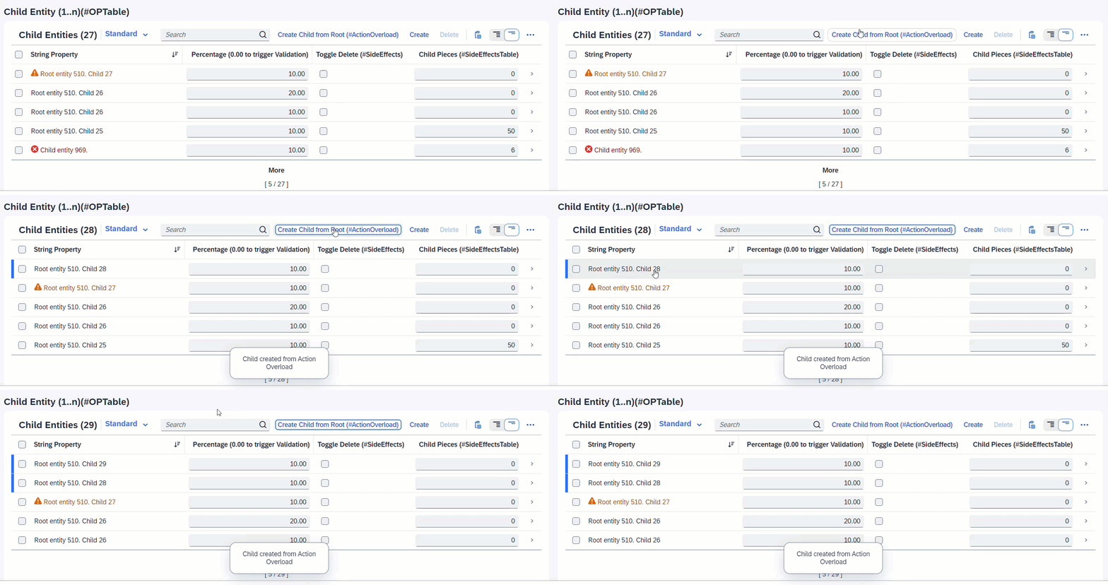
When createChildFromRoot is executed, a new Child instance is created. Since the associated entity _Child is a list table, the list will reload to also show the newly created instance.
ℹ️ Source: Behaviour Definition /DMO/FSA_C_RootTP
define behavior for /DMO/FSA_C_RootTP alias Root
{
  action ( features : instance ) createChildFromRoot result [0..1] entity /DMO/FSA_C_ChildTP;

  side effects {
    action createChildFromRoot affects entity _Child;
  }
}
ℹ️ Source: Metadata Extension /DMO/FSA_R_RootTP
annotate entity /DMO/FSA_C_RootTP with
{
  @UI.facet: [
    {
      purpose: #STANDARD,
      type: #PRESENTATIONVARIANT_REFERENCE,
      targetElement: '_Child',
      targetQualifier: 'pVariant',
      label: 'Child Entity (1..n)(#OPTable)',
      id: 'childEntitiesSection'
    }
  ]
  ...
}
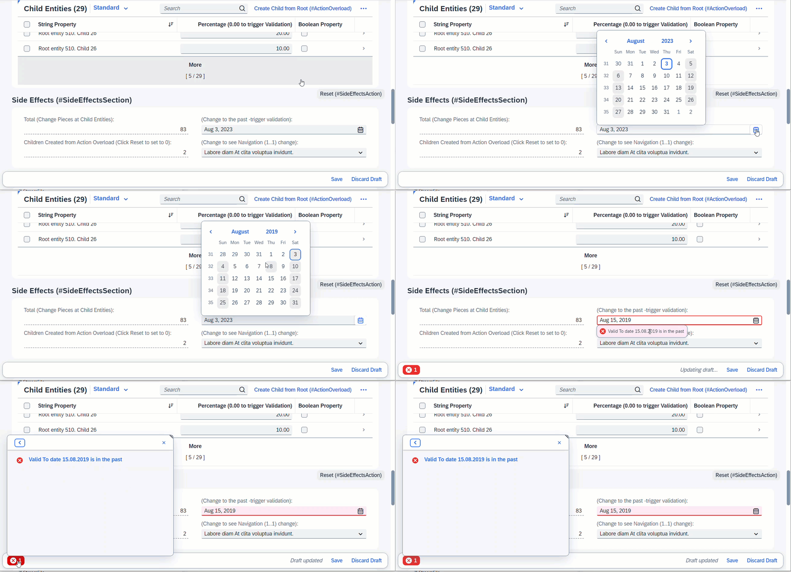
When field ValidTo is modified, this will trigger the determine action, which is a validation in this case. Any error messages arising from the validation will pop up immediately via sticky messages.
ℹ️ Source: Behaviour Definition /DMO/FSA_R_RootTP
define behavior for /DMO/FSA_R_RootTP alias Root
...
{
  validation validateValidTo on save   { create; update; field ValidTo; }
  determine action validateDate { validation validateValidTo; }

  side effects {
    determine action validateDate executed on field ValidTo affects messages;
  }
}
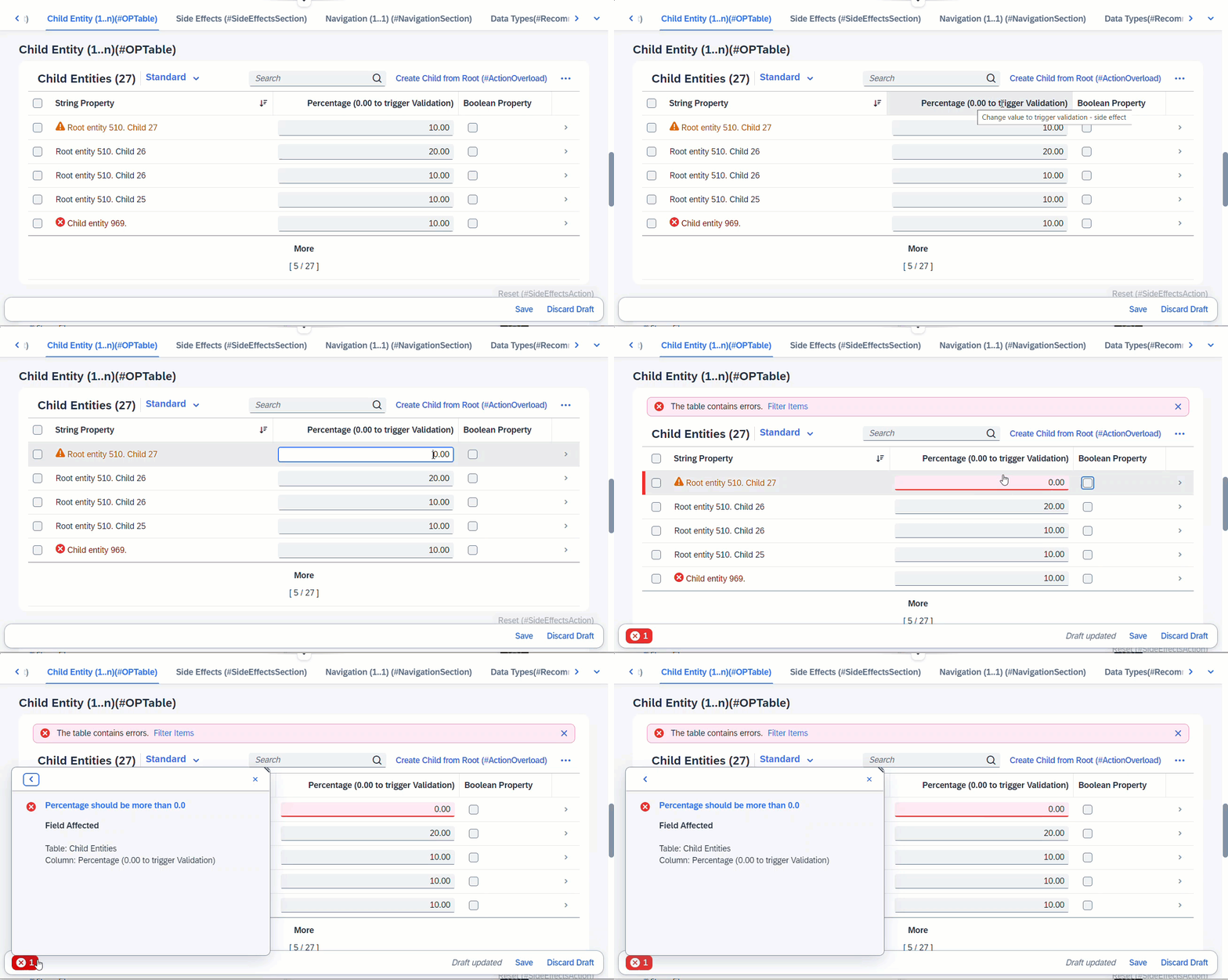
When any fields from entity _Child is modified, this will trigger the determine action, which is a validation defined at Child. Any error messages arising from the validation will pop up immediately via sticky messages.
ℹ️ Source: Behaviour Definition /DMO/FSA_R_RootTP
define behavior for /DMO/FSA_R_RootTP alias Root
...
{
  determine action validateChild { validation Child ~ validatePercentage; }

  side effects {
    determine action validateChild executed on entity _Child affects messages;
  }
}

define behavior for /DMO/FSA_R_ChildTP alias Child
...
{
  validation validatePercentage on save { create; update;  }
}
More Information: ABAP RESTful Application Programming Model - Side Effects
Search term: #HeaderInfo
The title and subtitle of an Object Page are defined with the annotation @UI.headerInfo.
ℹ️ Source: Metadata Extension /DMO/FSA_C_RootTP
// Search Term #HeaderInfo
@UI.headerInfo: {
  typeName: 'Object Page - Root',
  typeNamePlural: 'Root Entities (#ListTableTitle)', // Search Term #ListTableTitle
  typeImageUrl: 'sap-icon://sales-order',
  imageUrl: 'ImageUrl',
  title: {
    value: 'StringProperty',
    type: #STANDARD
  },
  description: {
    label: 'Root entity',
    type: #STANDARD,
    value: 'StringProperty'
  }
}
The attribute typeName is the title and it is displayed next to the SAP Logo in header bar on the Object Page. The attribute typeNamePlural will be shown, if all entities are shown in a table. The attribute title is displayed as the header in the Object Page in bold. Attribute description is shown beneath title and if the optional imageUrl is given, then the picture will be visible on the left side of the title and description. If no url is given for the imageUrl, but typeImageUrl is defined, it will be displayed instead.
More Information:
- ABAP RESTful Application Programming Model - Defining the Table Header of a List Report
- ABAP RESTful Application Programming Model - Defining the Title Section of an Object Page
Search term: #HeaderFacet
The header facet is displayed in the header of an Object Page. The facet is annotated with UI.facet.purpose: #HEADER.
ℹ️ Source: Metadata Extension /DMO/FSA_C_RootTP
@UI.facet: [
  // OPHEADER
  // Search Term #HeaderFacet, #KeyValue
  {
    purpose: #HEADER,
    type: #DATAPOINT_REFERENCE,
    targetQualifier: 'fieldWithPrice'
  }
]

// Search Term #HeaderFacet, #KeyValue
@UI.dataPoint: {
  qualifier: 'fieldWithPrice',
  title: 'Field with Price (#HeaderFacet)'
}
FieldWithPrice;
More Information: ABAP RESTful Application Programming Model - Using Facets to change the Object Page Layout
Search term: #HeaderFieldGroup, #ContactInHeader, #OPQuickView
Field groups can be part of a header.
ℹ️ Source: Metadata Extension /DMO/FSA_C_RootTP
// Search Term #HeaderFieldGroup
@UI.facet: [
  {
    purpose: #HEADER
    label      : 'General Data (#HeaderFieldGroup)',
    type       : #FIELDGROUP_REFERENCE,
    targetQualifier: 'HeaderData'
  }
]
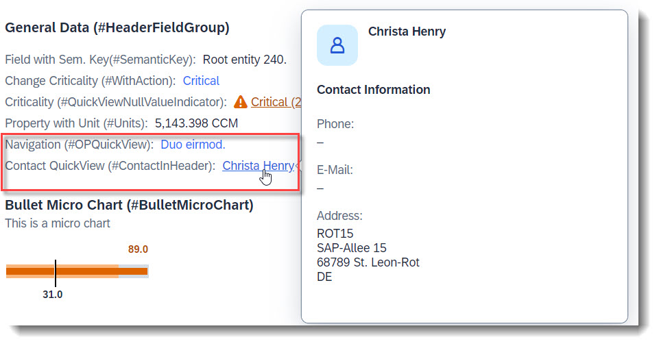
A quick view contact card can be displayed (#ContactInHeader). A QuickView can be displayed by just adding the property as a data field (#OPQuickView). Both implementations are identical to how they would be added as a line item in a List Report:
// Search Term #HeaderFieldGroup
@UI.fieldGroup: [
  {
    qualifier: 'HeaderData',
    position: 10,
    label: 'Field with Sem. Key(#SemanticKey)'
  }
]
StringProperty;

// Search Term #ContactInHeader, #HeaderFieldGroup
@UI.fieldGroup: [
  {
    qualifier: 'HeaderData',
    type: #AS_CONTACT,
    label: 'Contact QuickView (#ContactInHeader)',
    position: 70,
    value: '_Contact'
  }
]
ContactID;

// Search Term #HeaderFieldGroup, #WithAction
@UI.fieldGroup: [
  {
    qualifier: 'HeaderData',
    criticality: 'CriticalityCode',
    position: 20,
    label: 'Change Criticality (#WithAction)',
    dataAction: 'changeCriticality',
    type: #WITH_ACTION
  }
]
FieldWithCriticality;

// Search Term #HeaderFieldGroup, #OPQuickView
@UI.fieldGroup: [
  {
    qualifier: 'HeaderData',
    position: 50,
    label: 'Navigation QuickView (#OPQuickView)'
  }
]
NavigationID;
Search term: #SemanticKey
Semantic Key fields can be defined, with the annotation @ObjectModel.semanticKey, which consists of an array of properties from the entity. The given fields will be displayed in bold, and when possible the editing status will be displayed.
ℹ️ Source: CDS View /DMO/FSA_R_RootTP
// Search Term #SemanticKey
@ObjectModel.semanticKey: ['StringProperty']
Search term: #PlainText
Plain text can be displayed, by adding a standard property to a field group and using this field group as a target of a reference facet.
The property in the field group can be optionally annotated with @UI.MultiLineText, especially if you have a long text and would like it to be show in the UI as a multi-line text, with an expand/collapse button.
ℹ️ Source: Metadata Extension /DMO/FSA_C_RootTP
// Search Term #PlainText
@UI.facet: [
  {
    purpose: #HEADER,
    type: #FIELDGROUP_REFERENCE,
    label: 'Plain Text (#PlainText)',
    targetQualifier: 'plainText'
  }
]

@UI: {
  // Search Term #PlainText
  fieldGroup: [ { qualifier: 'plainText' } ]
  // Search Term #MultiLineText
  multiLineText: true
}
Description;
More Information: ABAP RESTful Application Programming Model - Grouping Fields
Search term: #AddressFacet
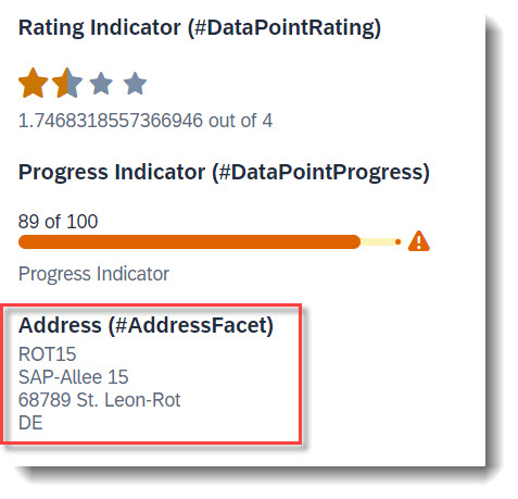
The property of an entity annotated with @Semantics.address.label can be directly displayed in an address facet, with target qualifier 'pref' if no specific qualifier is set. The label will be used as is, therefore it needs to be fully formatted. Linebreaks can be achieved with '\n'.
ℹ️ Source: CDS View /DMO/FSA_I_Contact
// Search Term #CONTACT
define view entity /DMO/FSA_I_Contact
...
{
  ...
  @Semantics.address.label: true
  @Consumption.valueHelpDefault.display:false
  address_label as AddressLabel,
}
ℹ️ Source: Metadata Extension /DMO/FSA_C_RootTP
// Search Term #AddressFacet
@UI.facet: [
  {
    purpose: #HEADER, // or #STANDARD
    label     : 'Address (#AddressFacet)',
    type      : #ADDRESS_REFERENCE,
    targetElement: '_Contact',
    targetQualifier: 'pref'
  }
]
Search term: #DataPointRating
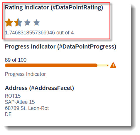
To add a rating indicator (stars) to the object page header, you first need to define a datapoint with @UI.dataPoint. The property where datapoint is defined sets how many stars are visible. Values between x.25 and x.74 are displayed as a half star. The attribute targetValue defines how many stars are possible. Most importantly, the qualifier needs to match the property name.
ℹ️ Source: Metadata Extension /DMO/FSA_C_RootTP
@UI: {
  // Search Term #DataPointRating, #DataPointRatingTable
  dataPoint: {
    qualifier: 'StarsValue',
    targetValue: 4,
    visualization: #RATING,
    title: 'Rating Indicator (#DataPointRating)'
  }
}
StarsValue;
After creating the data point, it has to be added to the @UI.facet annotation.
@UI.facet: [
  {
    // Search Term #DataPointRating
    purpose: #HEADER, // or #STANDARD
    type       : #DATAPOINT_REFERENCE,
    targetQualifier: 'StarsValue'
  }
]
Example: ABAP RESTful Application Programming Model - Develop Node Extensions - Extension Node with Rating
Search term: #DataPointProgress
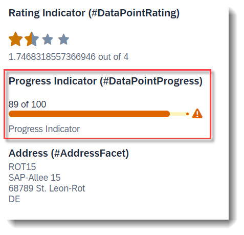
To add a progress indicator to the object page header, you first need to define a datapoint with @UI.dataPoint. The property where datapoint is defined sets the current progress and the attribute targetValue, the maximum progress. Additionally, a criticality can be given, if wanted. Most importantly, the qualifier needs to match the property name.
ℹ️ Source: Metadata Extension /DMO/FSA_C_RootTP
// Search Term #DataPointProgress, #DataPointProgressTable
@UI: {
  dataPoint: {
    qualifier: 'ProgressIntegerValue',
    targetValue: 100,
    visualization: #PROGRESS,
    criticality: 'CriticalityCode',
    title: 'Progress Indicator (#DataPointProgress)'
  }
}
ProgressIntegerValue;
After creating the data point, it has to be added to the @UI.facet annotation.
@UI.facet: [
  {
    // Search Term #DataPointProgress
    purpose: #HEADER, // or #STANDARD
    type       : #DATAPOINT_REFERENCE,
    targetQualifier: 'ProgressIntegerValue'
  }
]
Example: ABAP RESTful Application Programming Model - Develop Node Extensions - Extension Node with Progress
Search term: #KeyValue
A key value is the default data point, when the attribute visualization is not specified in @UI.dataPoint.
ℹ️ Source: Metadata Extension /DMO/FSA_C_RootTP
@UI.facet: [
  // Search Term #Headerfacet, #KeyValue
  {
    purpose: #HEADER,
    type: #DATAPOINT_REFERENCE,
    targetQualifier: 'fieldWithPrice'
  }
]

@UI: {
  // Search Term #HeaderFacet, #KeyValue
  dataPoint: {
    qualifier: 'fieldWithPrice',
    title: 'Field with Price (#HeaderDataPoint)'
  }
}
FieldWithPrice;
The following micro charts are supported: Area, Bullet, Radial, Column, Line, Harvey, Stacked bar and Comparison. Micro charts can only be displayed in the header.
A micro chart is defined with the @UI.chart annotation, which then is the target of a ReferenceFacet in the @UI.facet of purpose: #HEADER. The title of the facet is the attribute title of the annotation and the subtitle is description. If the property of the data point is a property with unit of measure, the unit will be displayed in the footer. The attribute measures of the chart has to be a data point.
The @UI.dataPoint supports generally the attributes criticality and criticalityCalculation, but the support varies between the micro chart types. If the value of the data point is annotated with a unit of measure, the unit will be shown as the footer of the micro chart facet.
In the following examples, all used attributes are mandatory.
Search term: #AreaMicroChart
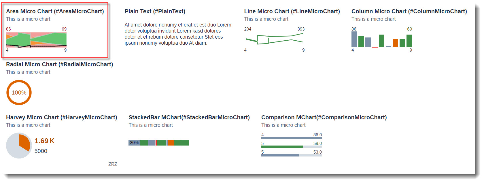
The area micro chart is a trend chart, which provides information for the actual and target value for a specified dimension. The displayed values at the bottom of the chart are the boundary values of the dimension. The values above the chart are the boundary values of the measure attribute.
ℹ️ Source: Metadata Extension /DMO/FSA_C_ChartTP
@UI.chart: [
  // Search Term #AreaMicroChart
  {
    qualifier: 'areaChart',
    title: 'Area Micro Chart (#AreaMicroChart)',
    description: 'This is a micro chart',
    chartType: #AREA,
    dimensions: ['Dimensions'],
    measures: ['IntegerValueForAreaChart'],
    measureAttributes: [
      {
        measure: 'IntegerValueForAreaChart',
        role: #AXIS_1,
        asDataPoint: true
      }
    ]
  }
]
The criticality calculation of the data point is mandatory, as each value is shown with its threshold (error, warning, acceptance and good) ranges.
// Search Term #AreaMicroChart
@UI.dataPoint: {
  qualifier: 'IntegerValueForAreaChart',
  targetValueElement: 'TargetValue',
  criticalityCalculation: {
    improvementDirection: #TARGET,
    toleranceRangeLowValueElement: 'AreachartTolLowerboundValue',
    toleranceRangeHighValueElement: 'AreachartTolUpperboundValue',
    deviationRangeHighValueElement: 'AreachartDevUpperboundValue',
    deviationRangeLowValueElement: 'AreachartDevLowerboundValue'
  }
}
IntegerValueForAreaChart;
ℹ️ Source: Metadata Extension /DMO/FSA_C_RootTP
// Search Term #AreaMicroChart
@UI.facet: [
  {
    purpose: #HEADER,
    type       : #CHART_REFERENCE,
    targetQualifier: 'areaChart',
    targetElement: '_Chart'
  }
]
More Information: ABAP RESTful Application Programming Model: Visualizing Data with Charts
Search term: #BulletMicroChart
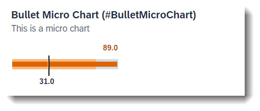
The bullet chart features a single measure and compares it to one or more other measures (e.g. value with target comparison). Both criticality and criticalityCalculation are supported, but if both are given criticality overrides criticalityCalculation. The bullet chart does not support the criticality value of 5 (new item). The measuresAttributes, while it is mandatory, has no effect on the chart as the values come from datapoint.
ℹ️ Source: Metadata Extension /DMO/FSA_C_RootTP
Chart
// Search Term #BulletMicroChart, #BulletMicroChartTable
@UI.chart: [
  {
    qualifier: 'bulletChart',
    title: 'Bullet Micro Chart (#BulletMicroChart)',
    description: 'This is a micro chart',
    chartType: #BULLET,
    measures: ['IntegerValue'],
    measureAttributes: [
      {
        measure: 'IntegerValue',
        role: #AXIS_1,
        asDataPoint: true
      }
    ]
  }
]
Facet
// Search Term #BulletMicroChart
@UI.facet: [
  {
    purpose: #HEADER,
    type       : #CHART_REFERENCE,
    targetQualifier: 'bulletChart'
  }
]
Data Point. The attribute minimumValue is needed to render the chart properly. The value is the actual bar. The forecastValue is the bar in the background with a lower opacity and the targetValue is the dark line. Qualifier must be set to the name of the property.
// Search Term: #BulletMicroChart
@UI.dataPoint: {
  qualifier: 'IntegerValue', //IntegerValue: horizontal bar in relation to the goal line
  targetValueElement: 'TargetValue', //visual goal line in the UI
  forecastValue: 'ForecastValue', //horizontal bar behind the value bar with, slightly larger with higher transparency
  criticality: 'CriticalityCode',
  minimumValue: 0 //Minimal value, needed for output rendering
}
IntegerValue;
More Information: ABAP RESTful Application Programming Model: Visualizing Data with Charts
Search term: #RadialMicroChart
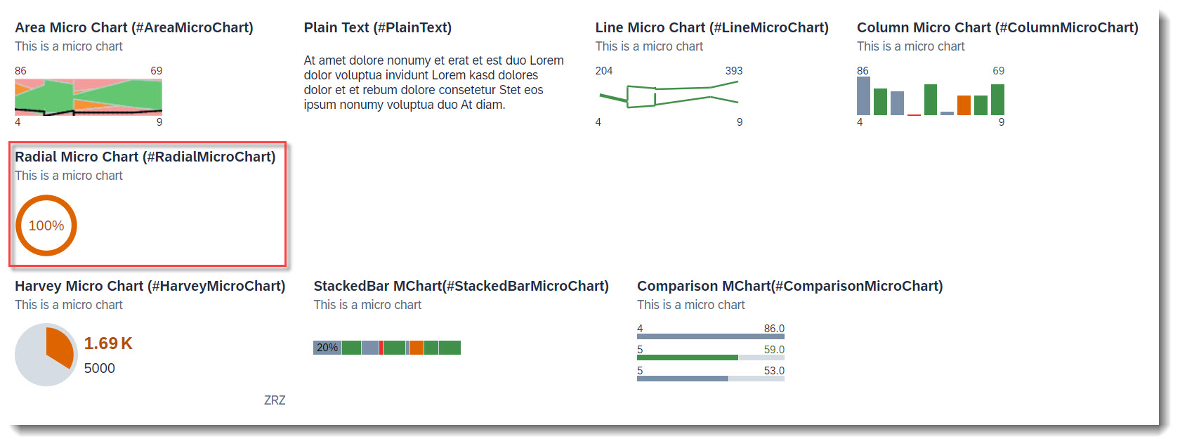
The radial micro chart displays a single percentage value. The measureAttributes, while mandatory, has no effect on the chart as the values come from datapoint.
ℹ️ Source: Metadata Extension /DMO/FSA_C_RootTP
Chart
// Search Term #RadialMicroChart
@UI.chart: [
  {
    qualifier: 'radialChart',
    title: 'Radial Micro Chart (#RadialMicroChart)',
    description: 'This is a micro chart',
    chartType: #DONUT,
    measures: ['RadialIntegerValue'],
    measureAttributes: [
      {
        measure: 'RadialIntegerValue',
        role: #AXIS_1,
        asDataPoint: true
      }
    ]
  }
]
Facet
// Search Term #RadialMicroChart
@UI.facet: [
  {
    purpose: #HEADER,
    type       : #CHART_REFERENCE,
    targetQualifier: 'radialChart'
  }
]
Data Point. The percentage value is the fraction of the property value and the target value. The unit of measure label will not be rendered, as the chart displays percentage values. Both criticality and criticalityCalculation are supported, but if both are given criticality overrides criticalityCalculation. Qualifier must be set to the name of the property.
// Search Term #RadialMicroChart
@UI.dataPoint: {
  qualifier: 'RadialIntegerValue',
  targetValueElement: 'TargetValue', //The relation between the value and the target value will be displayed as a percentage
  criticality: 'CriticalityCode'
}
RadialIntegerValue;
More Information: ABAP RESTful Application Programming Model: Visualizing Data with Charts
Search term: #LineMicroChart
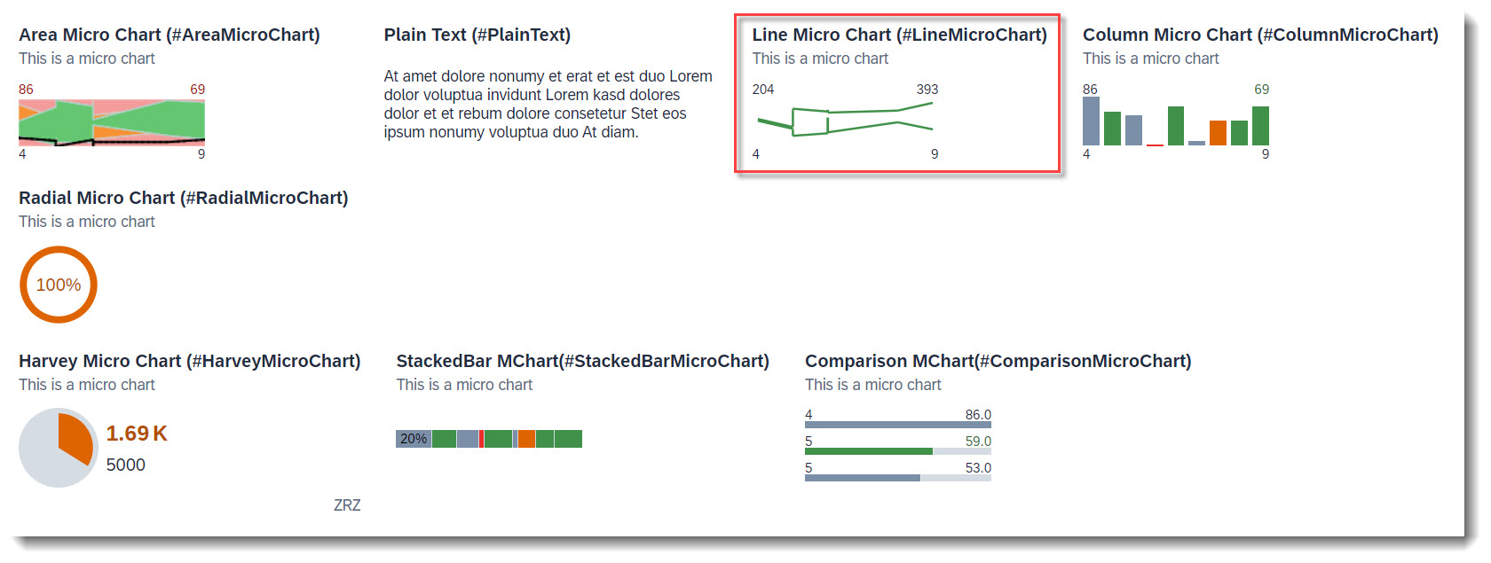
The line chart displays a series of data points as a line. The bottom values are the border values of the dimension. The upper left value is the smallest value of the first measures property and the upper right value is the largest value of the last measures property. The shown unit of measure is from the first entry.
ℹ️ Source: Metadata Extension /DMO/FSA_C_ChartTP
// Search Term #LineMicroChart
@UI.chart: [
  {
    qualifier: 'lineChart',
    title: 'Line Micro Chart (#LineMicroChart)',
    description: 'This is a micro chart',
    chartType: #LINE,
    measures: ['IntegerValueForLineChart', 'TargetValue'],
    dimensions: ['Dimensions'],
    measureAttributes: [
      {
        measure: 'IntegerValueForLineChart',
        role: #AXIS_2,
        asDataPoint: true
      },
      {
        measure: 'TargetValue',
        role: #AXIS_2,
        asDataPoint: true
      }
    ]
  }
]
Data Points. It is recommended to only use one measure, and a maximum of three measures, if more is required. If the attribute criticality contains a path, then the value of the last data point's criticality determines the color of the line.
// Search Term #LineMicroChart
@UI: {
  dataPoint: {
    qualifier: 'TargetValue',
    criticality: 'CriticalityCode'
  }
}
TargetValue;

// Search Term #LineMicroChart
@UI.dataPoint: {
  qualifier: 'IntegerValueForLineChart',
  criticality: 'CriticalityCode'
}
IntegerValueForLineChart;
ℹ️ Source: Metadata Extension /DMO/FSA_C_RootTP
// Search Term #LineMicroChart
@UI.facet: [
  {
    purpose: #HEADER,
    type: #CHART_REFERENCE,
    targetQualifier: 'lineChart',
    targetElement: '_Chart'
  }
]
More Information: ABAP RESTful Application Programming Model: Visualizing Data with Charts
Search term: #ColumnMicroChart
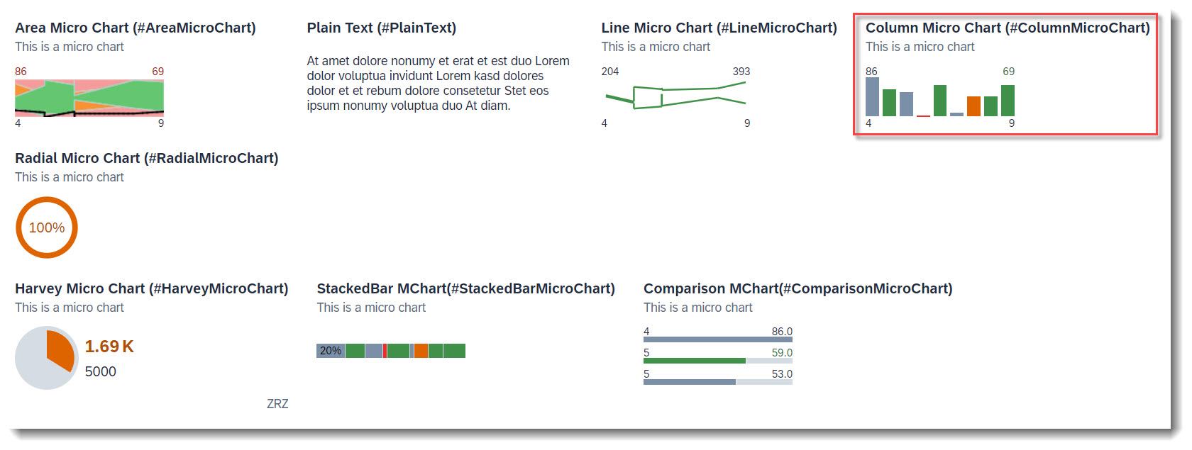
A column chart uses vertical bars to compare values of a dimension. The displayed values at the bottom of the chart are the boundary values of the dimensions. The values above the chart are the boundary values of the measureAttributes.
ℹ️ Source: Metadata Extension /DMO/FSA_C_ChartTP
// Search Term #ColumnMicroChart
@UI.chart: [
  {
    qualifier: 'columnChart',
    title: 'Column Micro Chart (#ColumnMicroChart)',
    description: 'This is a micro chart',
    chartType: #COLUMN,
    measures: ['IntegerValueForOtherCharts'],
    dimensions: ['Dimensions'],
    measureAttributes: [
      {
        measure: 'IntegerValueForOtherCharts',
        role: #AXIS_1,
        asDataPoint: true
      }
    ]
  }
]
Data Point. Both criticality and criticalityCalculation are supported, but if both are given criticality overrides criticalityCalculation.
// Search Term #ColumnMicroChart, #StackedBarMicroChart, #ComparisonMicroChart
@UI.dataPoint: {
  qualifier: 'IntegerValueForOtherCharts',
  criticality: 'CriticalityCode'
}
IntegerValueForOtherCharts;
ℹ️ Source: Metadata Extension /DMO/FSA_C_RootTP
// Search Term #ColumnMicroChart
@UI.facet: [
  {
    purpose: #HEADER,
    type: #CHART_REFERENCE,
    targetQualifier: 'columnChart',
    targetElement: '_Chart'
  }
]
More Information: ABAP RESTful Application Programming Model: Visualizing Data with Charts
Search term: #HarveyMicroChart
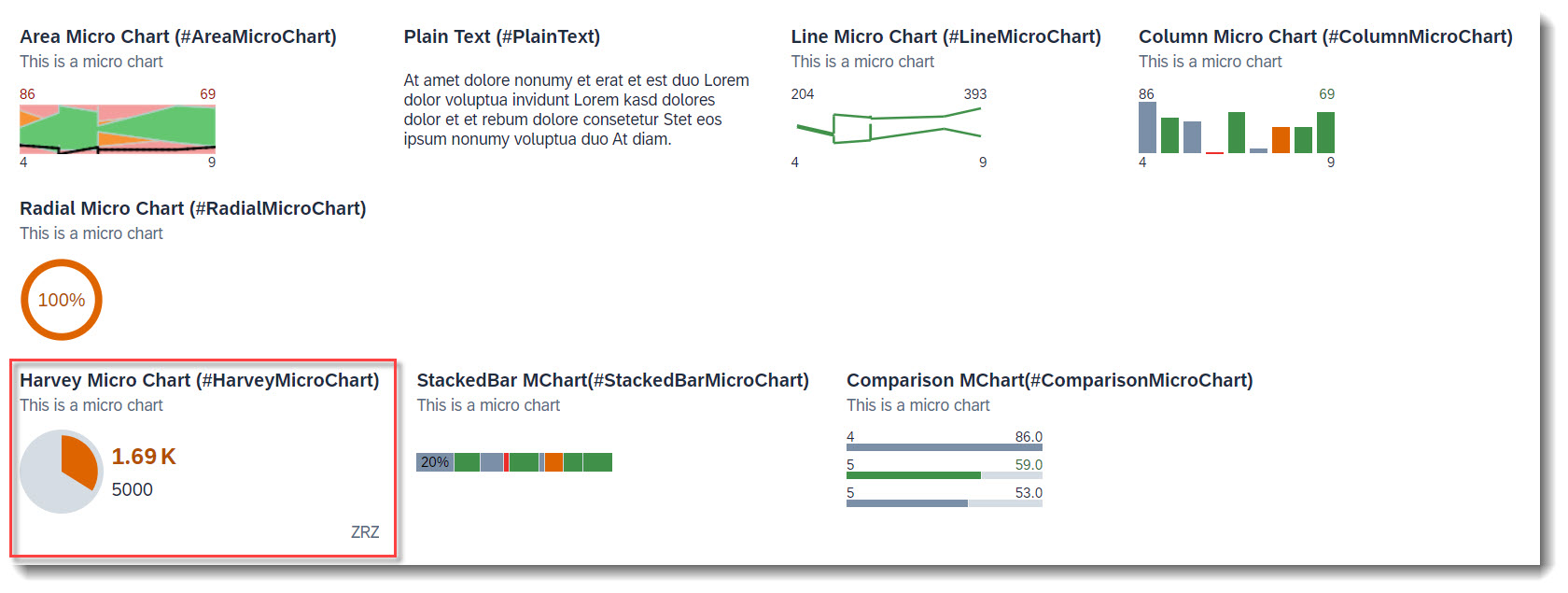
A harvey chart plots a single measure value against a maximum value.
ℹ️ Source: Metadata Extension /DMO/FSA_C_RootTP
Chart
// Search Term #HarveyMicroChart
@UI.chart: [
  {
    qualifier: 'harveyChart',
    title: 'Harvey Micro Chart (#HarveyMicroChart)',
    description: 'This is a micro chart',
    chartType: #PIE,
    measures: ['HarveyFieldWithPrice'],
    measureAttributes: [
      {
        measure: 'HarveyFieldWithPrice',
        role: #AXIS_1,
        asDataPoint: true
      }
    ]
  }
]
Data Point. For the semantic coloring, only the attribute criticality is supported.
//Search-Term: #HarveyMicroChart
@UI.dataPoint: {
  qualifier: 'HarveyFieldWithPrice',
  maximumValue: 5000,
  criticality: 'CriticalityCode'
}
HarveyFieldWithPrice;
Facet
// Search Term #HarveyMicroChart
@UI.facet: [
  {
    purpose: #HEADER,
    type: #CHART_REFERENCE,
    targetQualifier: 'harveyChart'
  }
]
More Information: ABAP RESTful Application Programming Model: Visualizing Data with Charts
Search term: #StackedBarMicroChart
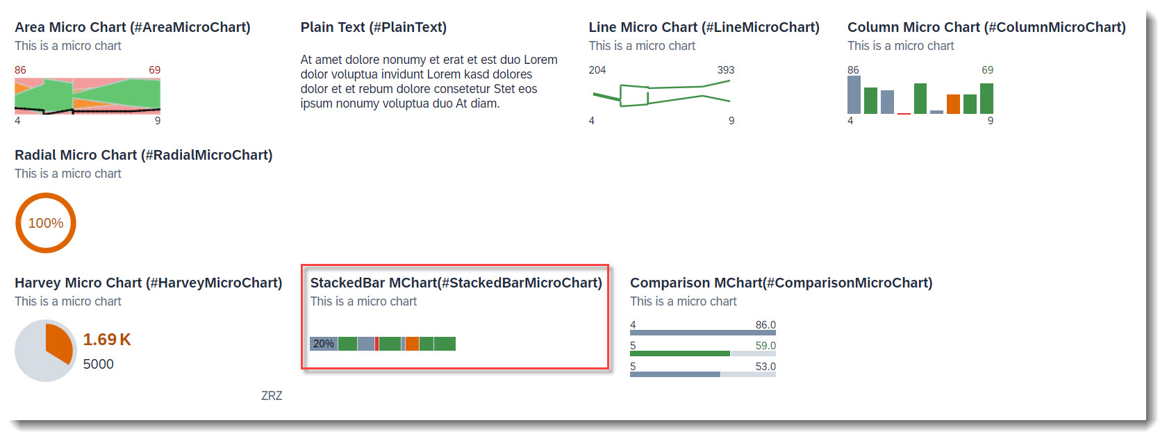
A stacked bar chart uses vertical bars to compare values of a dimension. The displayed values at the bottom of the chart are the boundary values of the dimensions. The values above the chart are the boundary values of the measureAttributes.
ℹ️ Source: Metadata Extension /DMO/FSA_C_ChartTP
// Search Term #StackedBarMicroChart
@UI.chart: [ {
  qualifier: 'stackedBarChart',
  title: 'StackedBar Micro Chart (#StackedBarMicroChart)',
  description: 'This is a micro chart',
  chartType: #BAR_STACKED,
  measures: ['IntegerValueForOtherCharts'],
  dimensions: ['Dimensions'],
  measureAttributes: [
    {
      measure: 'IntegerValueForOtherCharts',
      role: #AXIS_1,
      asDataPoint: true
    }
  ]
}]
Data Point. Both criticality and criticalityCalculation are supported, but if both are given criticality overrides criticalityCalculation.
// Search Term #ColumnMicroChart, #StackedBarMicroChart, #ComparisonMicroChart
@UI.dataPoint: {
  qualifier: 'IntegerValueForOtherCharts',
  criticality: 'CriticalityCode'
}
IntegerValueForOtherCharts;
ℹ️ Source: Metadata Extension /DMO/FSA_C_RootTP
// Search Term #StackedBarMicroChart
@UI.facet: [
  {
    purpose: #HEADER,
    type: #CHART_REFERENCE,
    targetQualifier: 'stackedBarChart',
    targetElement: '_Chart'
  }
]
More Information: ABAP RESTful Application Programming Model: Visualizing Data with Charts
Search term: #ComparisionMicroChart
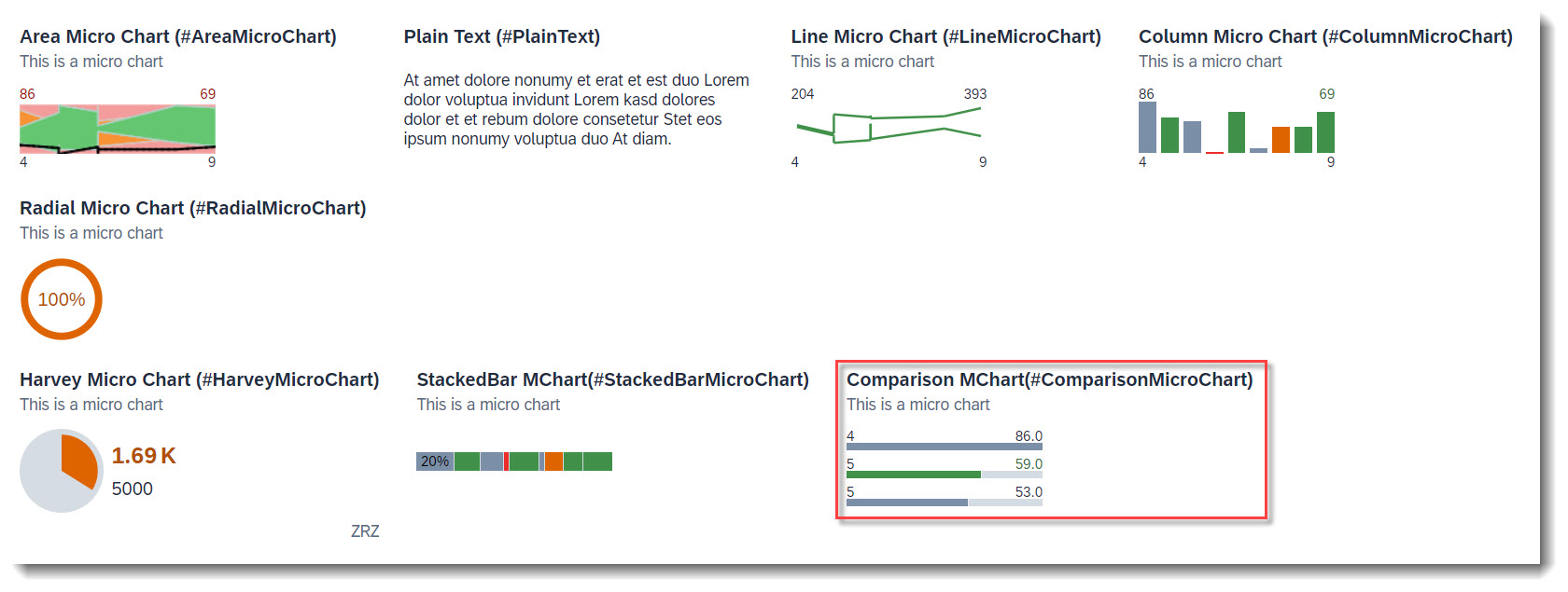
A comparison chart uses three horizontal bars to compare values of a dimension. If more values are defined in dimensions, they will only show up in the tooltip. The displayed values on the left represent the dimension value of each data point. The values on the right are the actual values. If a unit of measure is shown, then it is from the first data point to be plotted.
ℹ️ Source: Metadata Extension /DMO/FSA_C_ChartTP
// Search Term #ComparisonMicroChart
@UI.chart: [
  {
    qualifier: 'comparisonChart',
    title: 'Comparison Micro Chart (#ComparisonMicroChart)',
    description: 'This is a micro chart',
    chartType: #BAR,
    measures: ['IntegerValueForOtherCharts'],
    dimensions: ['Dimensions'],
    measureAttributes: [
      {
        measure: 'IntegerValueForOtherCharts',
        role: #AXIS_1,
        asDataPoint: true
      }
    ]
  }
]
Data Point. For semantic coloring, only the attribute criticality is supported.
// Search Term #ColumnMicroChart, #StackedBarMicroChart, #ComparisonMicroChart
@UI.dataPoint: {
  qualifier: 'IntegerValueForOtherCharts',
  criticality: 'CriticalityCode'
}
IntegerValueForOtherCharts;
ℹ️ Source: Metadata Extension /DMO/FSA_C_RootTP
// Search Term #ComparisonMicroChart
@UI.facet: [
  {
    purpose: #HEADER,
    type: #CHART_REFERENCE,
    targetQualifier: 'comparisonChart',
    targetElement: '_Chart'
  }
]
More Information: ABAP RESTful Application Programming Model: Visualizing Data with Charts
Search term: #Stream
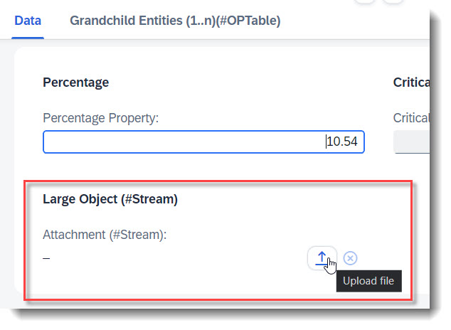
You can enable your RAP application for maintaining large objects (LOBs). By doing so, you provide end users the option to incorporate external binary files or text files when editing entity instances. First the appropriate fields should be added into the database table and the CDS view, and also the annotations @Semantics.largeObject and @Semantics.mimeType. To show it in a standard or header facet, you will need annotation @UI.facet. Lastly, you should also update the mapping and the draft table in your behaviour definition.
ℹ️ Source: Database Table /DMO/FSA_ChildA
stream_filename    : abap.char(128);
stream_mimetype    : abap.char(128);
stream_file        : abap.rawstring(0);
ℹ️ Source: CDS View /DMO/FSA_C_ChildTP
StreamFilename, // Search Term #Stream

// Search Term #Stream
@Semantics.largeObject: {
  acceptableMimeTypes: [ 'image/*', 'application/*' ],
  cacheControl.maxAge: #MEDIUM,
  contentDispositionPreference: #INLINE, // #ATTACHMENT - download as file
                                             // #INLINE - open in new window
  fileName: 'StreamFilename',
  mimeType: 'StreamMimeType'
}
StreamFile,

// Search Term #Stream
@Semantics.mimeType: true
StreamMimeType,
ℹ️ Source: Metadata Extension /DMO/FSA_C_ChildTP
// Search Term #Stream
@UI.facet: [
  {
    purpose: #STANDARD,
    type: #COLLECTION,
    id: 'Collection',
    label: 'Data'
  },
  {
    purpose: #STANDARD
    type: #FIELDGROUP_REFERENCE,
    targetQualifier: 'Stream',
    label: 'Large Object (#Stream)',
    parentId: 'Collection'
  }
]

// Search Term #Stream
@UI.hidden: true
StreamMimeType;

@UI.fieldGroup: [{ position: 10, qualifier: 'Stream', label: 'Attachment (#Stream)' }] // Search Term #Stream
StreamFile;

// Search Term #Stream
@UI.hidden: true
StreamFilename;
ℹ️ Source: BDEF /DMO/FSA_R_ROOTTP
define behavior for /DMO/FSA_R_ChildTP alias Child {
...
mapping for /dmo/fsa_child_a {
  ..
  StreamFile = stream_file;
  StreamFilename = stream_filename;
  StreamMimeType = stream_mimetype;
}
More Information on data modelling for Large Object: ABAP RESTful Application Programming Model - Working with Large Objects
Search term: #OPCopyAction
💡 Only available with the latest SAP BTP or SAP S/4HANA Cloud, public edition release and for SAP S/4HANA, on-premise edition or SAP S/4HANA Cloud, private edition, from release 2023 onwards.
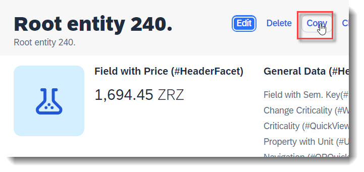
For a deep copy of an instance, the RAP framework does not provide a copy action out of the box, unlike create/edit/delete. However you can define a factory action in the BDEF that copies an instance, and by using the keyword isCopyAction: true, the action button will be rendered in UI harmoniously with Edit/Delete.
The cardinality of a factory action is always [1], that means, only one instance can be copied at a time.
When no label is provided, it is automatically set to 'Copy'.
ℹ️ Source: Metadata Extension /DMO/FSA_C_RootTP
@UI.identification: [
  // Search Term #OPCopyAction
  {
    type:#FOR_ACTION,
    dataAction: 'copyInstance',
    isCopyAction: true
  }
]
ℹ️ Source: Behaviour Definition /DMO/FSA_R_RootTP
factory action copyInstance [1];
Search term: #OPHeaderAction
Actions for the Object Page in general are annotated using @UI.identification. The criticality only supports the values 0 (normal), 1 (red) and 3 (green). For normal actions the Object Page content is passed and for static actions, no context is passed.
ℹ️ Source: Metadata Extension /DMO/FSA_C_RootTP
// Search Term #OPHeaderAction
@UI.identification: [
  {
    type: #FOR_ACTION,  //Action in the RootEntities of the object page next to the edit button
    label: 'Change Criticality (#OPHeaderAction)',
    criticality: 'CriticalityCode',
    criticalityRepresentation: #WITH_ICON,
    dataAction: 'changeCriticality'
  }
]
ID;
ℹ️ Source: Behaviour Definition /DMO/FSA_R_RootTP
action changeCriticality parameter /DMO/FSA_D_ChangeCriticalityP result [1] $self;
More Information: ABAP RESTful Application Programming Model: Action Implementation - UI Consumption of actions
Search term: #DynamicCRUD
💡 Only available with the latest SAP BTP or SAP S/4HANA Cloud, public edition release and for SAP S/4HANA, on-premise edition or SAP S/4HANA Cloud, private edition, from release 2023 onwards.


The visibility of the "Edit", "Create" and "Delete" buttons in the Object Page can be dynamically adjusted. For example the delete operation can be dependent on a property of the entity, through the annotation @UI.deleteHidden. Fixed values true or false are also possible.
ℹ️ Source: Metadata Extension /DMO/FSA_C_RootTP
// Search Term #DynamicCRUD
@UI.updateHidden: #(UpdateHidden)
@UI.deleteHidden: #(DeleteHidden)
Search term: #WithActionInOP
💡 Only available with the latest SAP BTP or SAP S/4HANA Cloud, public edition release and for SAP S/4HANA, on-premise edition or SAP S/4HANA Cloud, private edition, from release 2023 onwards.
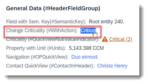
An action that is tied to a data value, which would be rendered as a hyperlink. Therefore it is crucial to specify the annotation at the desired element which has the data value.
The keyword to use for this is type: #WITH_ACTION.
ℹ️ Source: Metadata Extension /DMO/FSA_C_RootTP
@UI.facet: [
  // Search Term #HeaderCollectionFacet
  {
    purpose: #HEADER,
    id: 'FacetCollection',
    type: #COLLECTION
  },
  // Search Term #HeaderFieldGroup
  {
    parentId   : 'FacetCollection',
    label      : 'General Data (#HeaderFieldGroup)',
    type       : #FIELDGROUP_REFERENCE,
    targetQualifier: 'HeaderData'
  }
]

@UI: {
  fieldGroup: [
    // Search Term #HeaderFieldGroup, #WithActionInOP
    {
      qualifier: 'HeaderData',
      criticality: 'CriticalityCode',
      position: 30,
      label: 'Change Criticality (#WithActionInOP)',
      dataAction: 'changeCriticality',
      type: #WITH_ACTION
    }
  ]
}
FieldWithCriticality;
ℹ️ Source: Behaviour Definition /DMO/FSA_R_RootTP
action changeCriticality parameter /DMO/FSA_D_ChangeCriticalityP result [1] $self;
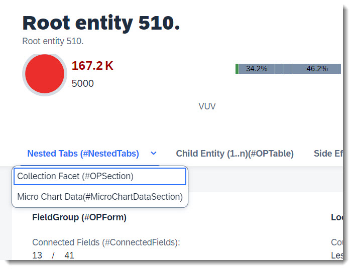
Multiple sub tabs can be placed underneath a main tab, called nesting. User can click on an expand button to show a drop down list of sub tabs. All that is needed is to define a Collection facet (main tab) and assign other Collection facets (the sub tabs) to it.
ℹ️ Source: Metadata Extension /DMO/FSA_C_RootTP
@UI.facet: [
  // Search Term #NestedTabs (Main Tab)
  {
    purpose: #STANDARD,
    type: #COLLECTION,
    label: 'Nested Tabs (#NestedTabs)',
    id: 'Nested'
  },
  // Search Term #OPSection (Sub tab, take note of parentID)
  {
    purpose: #STANDARD,
    type: #COLLECTION,
    label: 'Collection Facet (#OPSection)',
    id: 'collectionFacetSection',
    parentId: 'Nested'
  },
  // Search Term #MicroChartDataSection (Sub tab, take note of parentID)
  {
    purpose: #STANDARD,
    type: #COLLECTION,
    label: 'Micro Chart Data(#MicroChartDataSection)',
    id: 'chartDataCollection',
    parentId: 'Nested'
  }
]
Search term: #DisplayTextAndID
Instead of showing unreadable long IDs, there is the option to replace the ID with another text property from the entity, for example a name property. The @ObjectModel.text.element annotation specifies which value should be displayed instead of the original value.
ℹ️ Source: CDS View /DMO/FSA_I_Criticality
@ObjectModel.text.element: ['Name']
key code  as Code,
    name  as Name,
The @UI.textArrangement annotation defines how the new text is displayed. The options are #TextOnly, #TextFirst, #TextLast, #TextSeparate.
ℹ️ Source: Metadata Extension /DMO/FSA_C_RootTP
// Search Term #DisplayTextAndID
@UI.textArrangement: #TEXT_FIRST,
CriticalityCode;
More Information: ABAP RESTful Application Programming Model: Providing Text by Text Elements in the Same Entity
Search term: #HidingContent
Any header facet, section or data field can be hidden with the annotation @UI.xx.hidden. The annotation supports either fixed boolean values or values from a referenced property, as shown below.
ℹ️ Source: Metadata Extension /DMO/FSA_C_RootTP
// Search Term #HidingContent
@UI.facet: [
  {
    purpose: #HEADER, // or #STANDARD
    type: #FIELDGROUP_REFERENCE,
    label: 'Section Visible when in Edit(#HidingContent)',
    targetQualifier: 'ShowWhenInEdit',
    hidden: #( IsActiveEntity )
  }
]

@UI.fieldGroup: [ { qualifier: 'ShowWhenInEdit' }] // Search Term #HidingContent
StringProperty;
More Information: ABAP RESTful Application Programming Model: Hiding Fields Dynamically on the Object Page
Search term: #Preview
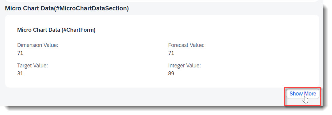
A reference facet in a collection facet is not shown after loading the app, when the reference facet has the @UI.facet.isPartOfPreview annotation and it is set to false. The sub section is then hidden beneath a "Show more" button on the UI.
ℹ️ Source: Metadata Extension /DMO/FSA_C_RootTP
// Search Term #Preview
@UI.facet: [
  {
    purpose: #STANDARD
    type: #COLLECTION,
    label: 'Micro Chart Data(#MicroChartDataSection)',
    id: 'chartDataCollection'
  },
  {
    parentId   : 'chartDataCollection',
    label      : 'Chart Data Preview (#Preview)',
    type       : #FIELDGROUP_REFERENCE,
    targetQualifier: 'chartDataPreview',
    isPartOfPreview: false
  }
]

@UI.fieldGroup: [ { qualifier: 'chartDataPreview' }] // Search Term #Preview
IntegerValue;
Search term: #MultiInputField
It is possible to have a multi input field which displays values from an association. When the values are from a child entity with delete capability, you are able to delete the entity in edit mode, directly from the multi input field.
It is not necessary to use the @UI.fieldGroup annotation to display the field, it is just annotated as such in the app to group and display it. It is however necessary, to use the datafield attribute value to set the source of the input, in this case the field StringProperty via the association _Child.
ℹ️ Source: Metadata Extension /DMO/FSA_C_RootTP
@UI.facet: [
  {
    // Search Term #OPForm
    purpose: #HEADER, // or #STANDARD
    label      : 'FieldGroup (#OPForm)',
    type       : #FIELDGROUP_REFERENCE,
    targetQualifier: 'OPForm',
    id: 'SubSectionID'
  }
]

// Search Term #MultiInputField
@UI.fieldGroup: [
  {
    label: 'Multi Input Field (#MultiInputField)',
    qualifier: 'OPForm',
    value: '_Child.StringProperty',
    position: 40
  }
]
Child;
Search term: #PresentationVariant-Child
A presentation variant defines how the result of a queried collection of entities is shaped and how this result is displayed, for example as a list report or a chart (@UI.presentationVariant.visualizations), the sorting order (@UI.presentationVariant.sortOrder), or the number of items (@UI.presentationVariant.maxItems) to display per segment.
ℹ️ Source: Metadata Extension /DMO/FSA_C_ChildTP
// Search Term #PresentationVariant-Child
@UI.presentationVariant: [
  {
    qualifier: 'pVariant',
    maxItems: 5,
    sortOrder: [
      {
        by: 'StringProperty',
        direction: #DESC
      }
    ],
    visualizations: [{type: #AS_LINEITEM}]
  }
]
To use presentation variant for a child entity in the object page, it is necessary to annotate @UI.facet with the correct type in the root entity: #PRESENTATIONVARIANT_REFERENCE instead of #LINEITEM_REFERENCE.
ℹ️ Source: Metadata Extension /DMO/FSA_C_RootTP
// Search Term #OPTable, #PresentationVariant-Child
@UI.facet: [
  {
    purpose: #STANDARD,
    type: #RESENTATIONVARIANT_REFERENCE,
    targetElement: '_Child',
    targetQualifier: 'pVariant',
    label: 'Child Entity (1..n)(#OPTable)',
    id: 'childEntitiesSection'
  }
]
Search term: #SelectionVariant-Child
With a selection variant, you can define how the fields of an entity set should be filtered. The attribute text is the title of the view and filter contains all filter parameters.
ℹ️ Source: Metadata Extension /DMO/FSA_C_ChildTP
// Search Term #SelectionVariant
@UI.selectionVariant: [
  {
    qualifier: 'sVariant',
    text: 'SelectionVariant (Positive criticality)',
    filter: 'CriticalityCode EQ 3'
  }
]
Search term: #SelectionPresentationVariant-Child
A SelectionPresentationVariant bundles a Selection Variant and a Presentation Variant.
ℹ️ Source: Metadata Extension /DMO/FSA_C_ChildTP
// Search Term #SelectionPresentationVariant-Child
@UI.selectionPresentationVariant: [
  {
    qualifier: 'ChildSP',
    presentationVariantQualifier: 'pVariant',
    selectionVariantQualifier: 'sVariant'
  }
]
Search term: #ConnectedFields

When two properties are semantically connected, they can be displayed next to each other under one label, to show their data relation. The connected field is defined with the annotation @UI.connectedFields. The attribute template is a string which defines in which order the properties are displayed and what is displayed between both properties, for example a slash.
ℹ️ Source: Metadata Extension /DMO/FSA_C_RootTP
// Search Term #ConnectedFields
@UI.connectedFields: [
  {
    qualifier: 'ConnectedFields',
    groupLabel: 'Connected Fields (#ConnectedFields)',
    name: 'integer',
    template: '{integer} / {target}'
  }
]
IntegerValue;

// Search Term #ConnectedFields
@UI.connectedFields: [
  {
    qualifier: 'ConnectedFields',
    name: 'target'
  }
]
TargetValue;
The connected field can only be displayed in a form using @UI.fieldGroup or in a #STANDARD facet. They cannot be rendered in a table with @UI.lineItem, with @UI.identification or in header facets.
@UI.facet: [
  {
    // Search Term #OPForm
    purpose    : #STANDARD,
    label      : 'FieldGroup (#OPForm)',
    type       : #FIELDGROUP_REFERENCE,
    targetQualifier: 'OPForm',
    id: 'SubSectionID'
  }
]

// Search Term #ConnectedFields
@UI.fieldGroup: [
  {
    qualifier: 'OPForm',
    type: #AS_CONNECTED_FIELDS,
    valueQualifier: 'ConnectedFields',
    position: 10
  }
]
IntegerValue;
Search term: #OPDetermineAction
💡 Only available with the latest SAP BTP or SAP S/4HANA Cloud, public edition release and for SAP S/4HANA, on-premise edition or SAP S/4HANA Cloud, private edition, from release 2023 onwards.
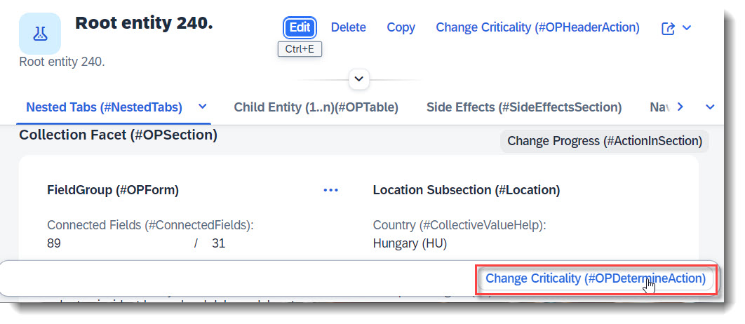
Determining actions are used to trigger actions directly using the context of the page in the object page, like an action that completes a process step (e.g. approve, reject). The action button will appear at the footer of the object page. This only works with @UI.identification and keyword determining: true.
ℹ️ Source: Metadata Extension /DMO/FSA_C_RootTP
@UI.identification: [
  // Search Term #OPDetermineAction
  {
    type: #FOR_ACTION,
    label: 'Change Criticality (#OPDetermineAction)',
    criticality: 'CriticalityCode',
    dataAction: 'changeCriticality',
    determining: true
  }
]
ℹ️ Source: Behaviour Definition /DMO/FSA_R_RootTP
action changeCriticality parameter /DMO/FSA_D_ChangeCriticalityP result [1] $self;
Search term: #ActionInSection

Sections can have their own actions, which show up in the upper right corner of the section by default. This is done through annotation @UI.facet.
ℹ️ Source: Metadata Extension /DMO/FSA_C_RootTP
@UI.facet: [
  // Search Term #OPForm
  {
    purpose    : #HEADER, // or #STANDARD,
    label      : 'FieldGroup (#OPForm)',
    type       : #FIELDGROUP_REFERENCE,
    targetQualifier: 'OPForm',
    id: 'SubSectionID'
  }
]

// Search Term #ActionInSection
@UI.fieldGroup: [
  {
    qualifier: 'OPForm',
    dataAction: 'changeProgress',
    type: #FOR_ACTION,
    emphasized: true,
    criticality: 'CriticalityCode',
    label: 'Change Progress (#ActionInSection)'
  }
]
LastChangedAt;
ℹ️ Source: Behaviour Definition /DMO/FSA_R_RootTP
action changeProgress parameter /DMO/FSA_D_ChangeProgressP result [1] $self;
Search term: #InlineActionInForm
💡 Only available with the latest SAP BTP or SAP S/4HANA Cloud, public edition release and for SAP S/4HANA, on-premise edition or SAP S/4HANA Cloud, private edition, from release 2023 onwards.
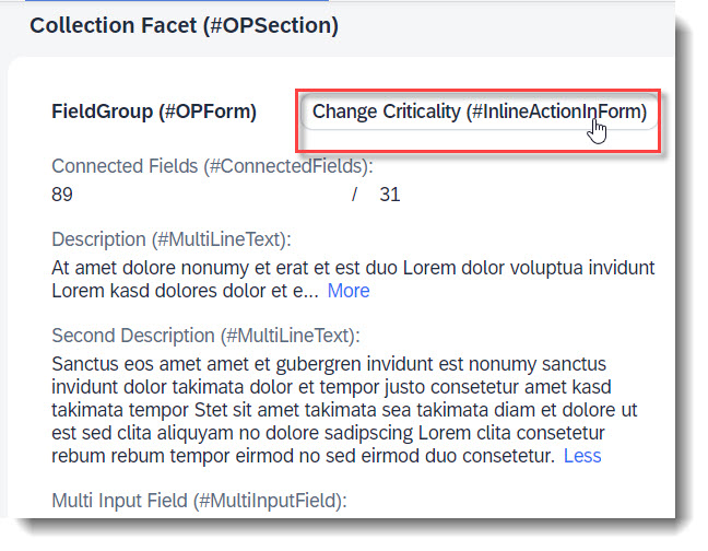
Forms can also have their own actions, which show up in the upper right corner of the form by default. This is done through annotation @UI.facet and UI.fieldGroup.inline: true.
ℹ️ Source: Metadata Extension /DMO/FSA_C_RootTP
@UI.facet: [
  // Search Term #OPForm
  {
    purpose    : #HEADER, // or #STANDARD,
    label      : 'FieldGroup (#OPForm)',
    type       : #FIELDGROUP_REFERENCE,
    targetQualifier: 'OPForm',
    id: 'SubSectionID'
  }
]

// Search Term #InlineActionInForm
@UI.fieldGroup: [
  {
    qualifier: 'OPForm',
    dataAction: 'changeCriticality',
    type: #FOR_ACTION,
    emphasized: true,
    inline: true,
    label: 'Change Criticality (#InlineActionInForm)'
  }
]
LastChangedAt;
ℹ️ Source: Behaviour Definition /DMO/FSA_R_RootTP
action changeProgress parameter /DMO/FSA_D_ChangeProgressP result [1] $self;
Search term: #SectionNavigation, #FormNavigation
External or intent based navigations are added in the App using @UI.fieldGroup. Depending on the type used (#FOR_INTENT_BASED_NAVIGATION or #WITH_INTENT_BASED_NAVIGATION), the navigation will either be rendered as a button at the section toolbar or a link.
An intent is the combination of an action and semantic object. There are 2 ways to achieve this.
Associating the semantic object using @Consumption.semanticObject and keyword semanticObjectAction in the UI anotation.
ℹ️ Source: Metadata Extension /DMO/FSA_C_RootTP
@UI.facet: [
  // Search Term #OPForm
  {
    purpose    : #HEADER, // or #STANDARD,
    label      : 'FieldGroup (#OPForm)',
    type       : #FIELDGROUP_REFERENCE,
    targetQualifier: 'OPForm',
    id: 'SubSectionID'
  }
]

@Consumption.semanticObject: 'FeatureShowcaseNavigation'
@UI: {
  fieldGroup: [
    // Search Term #SectionNavigation ( Button )
    {
      qualifier: 'OPForm',
      label: 'IntentBased Navi (#SectionNavigation)',
      type: #FOR_INTENT_BASED_NAVIGATION,
      semanticObjectAction: 'manage'
    },
    // Search Term #FormNavigation ( Link )
    {
      qualifier: 'OPForm',
      label: 'IntentBased Navi (#FormNavigation)',
      type: #WITH_INTENT_BASED_NAVIGATION,
      value: 'NavigationID',
      semanticObjectAction: 'manage',
      position: 50
    }
  ]
}
NavigationID;
Search term: #UISemanticObject
💡 Only available with the latest SAP BTP or SAP S/4HANA Cloud, public edition release and for SAP S/4HANA, on-premise edition or SAP S/4HANA Cloud, private edition, from release 2023 onwards.
Associating the semantic object using keywords semanticObject, semanticObjectAction in the UI anotation.
Additionally you may set the binding if different values are to be used. You can use either localElement for a property in the CDS view, or localParameter for a CDS parameter.
ℹ️ Source: Metadata Extension /DMO/FSA_C_RootTP
@UI.facet: [
  // Search Term #HeaderCollectionFacet
  {
    purpose: #HEADER,
    id: 'FacetCollection',
    type: #COLLECTION
  },
  // Search Term #HeaderFieldGroup
  {
    parentId   : 'FacetCollection',
    label      : 'General Data (#HeaderFieldGroup)',
    type       : #FIELDGROUP_REFERENCE,
    targetQualifier: 'HeaderData'
  }
]

@UI: {
  fieldGroup: [
    // Search Term #UISemanticObject
    {
      qualifier: 'HeaderData',
      position: 40,
      label: 'IntentBased Navi (#UISemanticObject)',
      type: #WITH_INTENT_BASED_NAVIGATION,
      semanticObject: 'FeatureShowcaseContact',
      semanticObjectAction: 'manage',
      semanticObjectBinding: [{ localElement: 'Country', element: 'Country' }]
    }
  ]
}
ContactID;
More Information: ABAP RESTful Application Programming Model: Based on Intent
Search term: #OPTable
Table sections are most commonly for child entities or other associated entities. The implementation consists of two parts. First the associated or child entity needs the @UI.lineItem annotation. This defines which fields are displayed.
ℹ️ Source: Metadata Extension /DMO/FSA_C_GrandchildTP
@UI.lineItem: [{ position: 10 }] // Search Term #OPTable
StringProperty;
ℹ️ Source: Metadata Extension /DMO/FSA_C_ChildTP
Secondly the @UI.facet annotation needs to be added
// Search Term #OPTable
@UI.facet: [
  {
    purpose: #STANDARD,
    type: #LINEITEM_REFERENCE,
    targetElement: '_Grandchild',
    label: 'Grandchild Entities (1..n)(#OPTable)'
  }
]
Additionally it is also possible to show a table in a facet using the type #SELECTIONPRESENTATIONVARIANT_REFERENCE.
First the associated or child entity needs @UI.presentationVariant, @UI.selectionVariant, @UI.selectionPresentationvariant and @UI.lineItem annotation. This defines which fields are displayed.
ℹ️ Source: Metadata Extension /DMO/FSA_C_ChildTP
// Search Term  #OPTable
@UI: {
  // Search Term #PresentationVariant-Child
  presentationVariant: [
    {
      qualifier: 'pVariant',
      sortOrder: [
        {
          by: 'StringProperty',
          direction: #DESC
        }
      ],
      visualizations: [{type: #AS_LINEITEM}]
    }
  ],
  // Search Term #SelectionVariant-Child
  selectionVariant: [
    {
      qualifier: 'sVariant',
      text: 'SelectionVariant (Positive criticality)',
      filter: 'CriticalityCode EQ 3'
    }
  ],
  // Search Term #SelectionPresentationVariant-Child
  selectionPresentationVariant: [
    {
      presentationVariantQualifier: 'pVariant',
      selectionVariantQualifier: 'sVariant'
    }
  ]
}

annotate entity /DMO/FSA_C_ChildTP
  with
{
  ...
  @UI.lineItem: [{ position: 10 }] // Search Term #OPTable
  StringProperty;

  @UI.lineItem: [{ position: 20 }] // Search Term #OPTable
  FieldWithPercent;

  @UI.lineItem: [{
    position: 30,
    criticality: 'CriticalityCode'
  }]
  BooleanProperty;

}
Secondly the @UI.facet annotation needs to be added.
ℹ️ Source: Metadata Extension /DMO/FSA_C_RootTP
// Search Term #OPTable, #PresentationVariant-Child, #SelectionPresentationVariant-Child, #SelectionVariant-Child
@UI.facet: [
  {
    purpose: #STANDARD,
    type: #SELECTIONPRESENTATIONVARIANT_REFERENCE,
    targetElement: '_Child',
    label: 'Child Entity (1..n)(#OPTable)',
    id: 'childEntitiesSection'
  }
]
More Information: ABAP RESTful Application Programming Model: Tables
Search term: #OPTableTitle
The title of an Object Page table is the attribute typeNamePlural of the @UI.headerInfo annotation.
ℹ️ Source: Metadata Extension /DMO/FSA_C_RootTP
// Search Term #HeaderInfo
@UI.headerInfo: {
  ...
  typeNamePlural: 'Root Entities (#OPTableTitle)', // Search Term #OPTableTitle
  ...
}
If the section title and the table title are identical or the @UI.headerInfo annotation is not given, the table title will not be displayed. Also if the table is the only content in a subsection and has a title, the subsections title will not be displayed.
Search term: #ActionOverload
💡 Only available with the latest SAP BTP or SAP S/4HANA Cloud, public edition release and for SAP S/4HANA, on-premise edition or SAP S/4HANA Cloud, private edition, from release 2023 onwards.
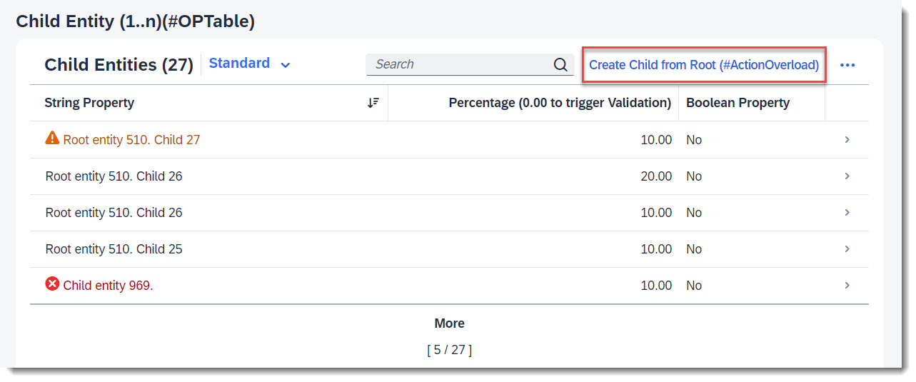
Action overload means to add an action bound to a higher level entity (parent), to the object page list table of a child entity. The action is defined in the parent behaviour definition, and the UI annotation to add the action is defined in the child CDS view or metadata extension.
The example given here, is an action button displayed at the Child entity table in section Child Entity (1..n)(#OPTable), that calls a Root action to create a new Child instance.
ℹ️ Source: Behaviour Definition /DMO/FSA_C_RootTP
define behavior for /DMO/FSA_C_RootTP alias Root
{
  action ( features : instance ) createChildFromRoot result [0..1] entity /DMO/FSA_C_ChildTP;
}
ℹ️ Source: Metadata Extension /DMO/FSA_C_ChildTP
// Search Term #ActionOverload
@UI.lineItem: [
  {
    type: #FOR_ACTION,
    dataAction: '/DMO/FSA_C_RootTP.createChildFromRoot',
    label: 'Create Child from Root (#ActionOverload)'
  }
]
StringProperty;
Search term: #ChartSection
As an alternative to micro charts in the header, charts are also possible as sections. However the implementation is more complex. As aggregation is not yet available for V4 services, which this app is based on, the following shows only an example of how a chart should be annotated.
First the entity needs @Aggregation.default annotations, which defines which aggregation methods are supported. This can only be done on views that are not transactional.
ℹ️ Source: CDS View /DMO/FSA_I_Chart
define view entity /DMO/FSA_I_Chart
  as select from zfsa_chart_a
  ...
{
  key id                             as ID,
      ...

      @EndUserText.label : 'Minimal Net Amount'
      @Aggregation.default: #MIN
      integer_value                  as MinAmount,

      @EndUserText.label : 'Maximal Net Amount'
      @Aggregation.default: #MAX
      integer_value                  as MaxAmount,

      @EndUserText.label : 'Average Net Amount'
      @Aggregation.default: #AVG
      integer_value                  as AvgAmount,
      ...
}
After that the @UI.chart can be defined. Please note, that the attribute measures contains the properties of the aggregation methods. If it is just a property of the entity, like "integerValue", the chart won't be displayed. The first property in the attribute dimensions has the default dimension. The second property is the category into which a drill down is possible.
The added actions to the attribute actions are shown in the chart toolbar.
ℹ️ Source: CDS View /DMO/FSA_C_ChartTP
// Search Term #ChartSection
@UI.chart: [
  {
    qualifier: 'Test',
    title: 'Chart (#ChartSection)',
    chartType: #COLUMN,
    dimensions: ['Dimensions', 'CriticalityCode'],
    measures: ['MaxAmount'],
    dimensionAttributes: [
      {
        dimension: 'Dimensions',
        role: #CATEGORY
      },
      {
        dimension: 'CriticalityCode',
        role: #CATEGORY
      }
    ],
    measureAttributes: [
      {
        measure: 'MaxAmount',
        role: #AXIS_1
      }
    ],
    actions: [{ type: #FOR_ACTION, dataAction: 'updateChart', label: 'Action at Chart' }]
  }
]
Lastly the chart needs to be added to the @UI.facet annotation. This section is commented out in the Feature Showcase App as Aggregation annotations are still not yet available in V4 services
ℹ️ Source: Metadata Extension /DMO/FSA_C_RootTP
// Search term #ChartSection
@UI.facet: [
  {
    id: 'chart',
    purpose: #STANDARD,
    type: #CHART_REFERENCE,
    targetElement: '_Chart',
    label: 'Chart (#ChartSection)'
  }
]
For semantic coloring of a dimension, the dimension property "CriticalityCode" is annotated with @UI.valueCriticality, where possible values of the property are matched against a criticality.
ℹ️ Source: Metadata Extension /DMO/FSA_C_ChartTP
// Search Term #ChartSection
@UI.valueCriticality: [
  {
    value: '1',
    criticality: #NEGATIVE
  },
  {
    value: '2',
    criticality: #CRITICAL
  },
  {
    value: '3',
    criticality: #POSITIVE
  }
]
CriticalityCode;
More Information: ABAP RESTful Application Programming Model: Visualizing Data with Charts
Copyright (c) 2022 - 2023 SAP SE or an SAP affiliate company. All rights reserved. This project is licensed under the SAP Sample Code License except as noted otherwise in the LICENSE file.